
Thursday, 31 December 2015
Captain Character: Edrik, The Flamboyant King of Vladya
Tuesday, 29 December 2015
Captain Character: Initial Iterations

 Creating a strong character is a time-worthy developmental process as one must implement an aspect of his own self into the character, making it radiate vivacity and energy. With this study task, we are to create a character based on an archetype, develop it, give it life, make a story, let it shine with emotion, artistically conceive. However, nothing's pragmatic when it comes to creating a character, as I firmly believe that a character designer or animator must broaden his or her horizons when trying to invent a new character and try multiple times before finally settling which appearance of the character is to fit the most. I chose to expand on one of the Jungian archetypes based on their signature emotion, assets, and visual aspects. I could not decide between the Sage and the Ruler, thus I resolved that by drawing iterations for both. After a lot of thinking, drawing, re-structuring, it seemed to me much more plausible to go with the Ruler, hence the Sages have signature beards which limit their possibility of expressing versatile emotions, along with the limited world of backstories they have (intelligent, eclectic, but passive). Choosing the Ruler gave me the opportunity to focus on facial features, because I wanted to make a rather arrogant king, one that is disrespectful towards his people but self-loving and narcissistic, and with that comes a fitting face. In terms of body shape, I only attempted two constructed out of basic shapes - one circular small one, and one trapezoid big one. I tried several designs of faces, interlaced with different facial hair and contours, but made them all by just combining basic shapes together, then following them to make a figure, a shape. Aside from that, the first thing I always draw in a character is their eyes, because I believe they are the most important part of emotional expression. For example, wide eyes can insinuate a childlike wonder, whereas smaller ones give off more of a depth and seriousness to the character, and for my own I needed the upper eyelid a little closed, because semi-open eyes along with a smile give off an assured certainty. Out of the several I did, I'll give it more thought and see which one fits!
Monday, 21 December 2015
The Other Side - Developmental Stages: Animating Movie Clips and Elements
 |
| Referential Drawing |


| Colored reference, drawing in use, sketchbook reference |
Monday, 14 December 2015
Set, Series, Sequence: Storyboard

Saturday, 12 December 2015
The Other Side - Developmental Stages: Creation of Backgrounds


Thursday, 10 December 2015
Understanding Animation: Rotoscoping in Early and Modern Animation
 Rotoscoping is a technique in animation which uses live footage as a foundation upon which animators draw frame by frame. In other words, with rotoscoping animators are able to create animation using live video as onion-skin, where they trace over the projected images. The rotoscope had been invented by the American inventor and animator Max Fleischer, and got patented under his name in 1915 with his debut "Out of The Inkwell" cartoon series. Initially, the rotoscope that Fleischer had invented used recorded live-action film images and projected them under a frozen glass panel - a complex mechanism that was quite the size. However, ever since its creation, the rotoscope had gradually advanced and its conventions of functionality had simplified, while still being used over the years to this day. Ranging animations from the Golden Era of Animation up to modern animation series, the rotoscope is still among the prevalent animation tools that help animators create life-like characters, as well as practice live drawing and tracing of lines. For example, A-ha's famous 1985 song "Take on Me" features a rotoscope animation which encompasses the story of a comic book character coming to life. In the music video, both live-action and animation are combined to create a phantasmagorical essence between what is real and what is not. Furthermore, according to Richard Shicklel, many sequences in Disney movies are rotoscoped, as actresses' performances were filmed and then used for lip-syncing and gestures. It goes without saying that the rotoscope still influences modern animators and has revolutionized the way we bring something still to life, as creators, as artists.
"A-ha - Take on Me" - https://www.youtube.com/watch?v=djV11Xbc914
Wednesday, 9 December 2015
Set, Series, Sequence: Symbolism and Derived Concepts from "Broccoli Brains"
Whilst creating the 12 images that follow-up the project, I was simultaneously thinking about the short narrative and what it will encompass. Thus, among the 12 images I was also creating key-frame scenes from my still-in-production narrative story. However, these images were not pure visuals from the action in the story, but also included the hidden thoughts of the main character from different perspectives. I created a backstory behind "Broccoli Brains" - broccoli feasting on the character's brain, like a parasite, becoming a menace. Taking this into consideration, I made the 12 images in relation to narration, but also in relation to drawing practice and styles of drawing.


Tuesday, 8 December 2015
Set, Series, Sequence: Sequential Imagery of "Broccoli Brains"

Perspective from above, with inkpen for accuracy.

Perspective from profile, no color.

Set, Series, Sequence: Practice of Depth with Charcoal
 |
| "Fear of Broccoli" |

Monday, 7 December 2015
Set, Series, Sequence: Character Design
 |
| "Frustrated Broccoli Chef" |
 |
| "Broccoli's Hair" |
 |
| "Broccoli Flawless" |
Wednesday, 2 December 2015
Set, Series, Sequence: Pastel Style
Now for coloring I used a new tool: pastel. Rarely have I ever colored with pastel (maybe in Elementary and Middle School?), but I had forgotten the wonders it can bring. Pastel is perfect for smudges and creating gradients of color, which is exactly why I chose this element for several drawings. Because pastel cannot define outlines (well, the light colored pastels), I only used them for coloring by following the shapes I had created with pencil. After laying down the colors, I used my fingers to smudge the residue left on the paper, either to create a gradation effect or to blur the colors, with the soul purpose of removing visible rough texture (as is the case with watercolor). However, only pastel was not enough, because it looked like a bunch of patterns inarticulately mixed together. Thus, after the color was put, I outlined the shapes and forms with an ink pen to add contour to the composition. Overall, it turned out successful, and I am glad that this project was assigned because now I'm trying out different ways of drawing which could be applied in traditional animation in the future.

This is one of my pastel drawings, named "Broccoli Forest". In it, due to the outlining of pastel, the broccoli seem to have an outer glow, adding the notion that they are haunted. Emphasis is placed on the color and absence of it rather than on the outlines of the shapes.

This is one of my pastel drawings, named "Broccoli Forest". In it, due to the outlining of pastel, the broccoli seem to have an outer glow, adding the notion that they are haunted. Emphasis is placed on the color and absence of it rather than on the outlines of the shapes.
Tuesday, 1 December 2015
Set, Series, Sequence: Watercolor Style Development
 Following up with a new technique, one I had never used prior, came the ink pencil + watercolor drawings. Same as the previous technique, I drew the outlines of the picture with pencil, and then overlapped them with an ink pen. However, this time I took "frantic" swipes with the ink pen instead of careful and pedantic ones. What I hoped to achieve with this was a whole new different atmosphere, one more dark, one more inky, less precise. But, instead of just pencil shading or coloring with wooden color pencils, I used watercolor. The reason I used watercolor was that with it I can manipulate the visual texture of the color instead of drawing inner contour lines. With watercolor, every brush swipe can be seen after the color dries out, which gives an artist aesthetic flexibility. Finally, for finesse, I sprayed ink on the drawings as to further strengthen the dominance of the color black and add to the murky and shadowed essence of the drawings. And finally, for the sake of experimentation, I mixed gold ink with black ink, took a piece of broccoli, dipped it in the ink, slapped it on a piece of paper, let it dry, then drew around it. Instead of copying the outline of broccoli using referential images, I let the broccoli do it's own form, natural in a way. Kinda post-modern, but hey, wonderful ideas sprouted!

The initial ink blots made with broccoli.
The final drawing, named "Cosmic Broccoli"
Sunday, 29 November 2015
Understanding Animation: The Evolution of Bugs Bunny
As every animator knows, the very initial idea of a character is never solidly considered. It is always built upon, always altering, always evolving, providing the animator with developmental practice. Prior to this course, I had rarely considered character development, usually sticking with the first or second "draft" of a character (keep in mind, I mainly did stop-motion, so characters were literally built and never conceptualized with drawings prior-hand). Thus, in order to understand this process further and develop my skill for it I looked into the evolution of the Looney Tunes character Bugs Bunny.

Bugs Bunny's first official appearance under that pseudonym was in the Tex Avery episode "A Wild Hare", whereas before that there were several prototypical appearances of the character. According to the book "Bugs Bunny: Fifty Years and Only One Grey Hare", Bugs Bunny was "born" on the 27th of July in 1940, and ever since then has been evolving visually, but also characteristically. What struck the audience about this character was his ever-growing nonchalance towards the myriad of situations he was thrown into, and soon enough became a mascot for Warner Bros. During Bugs' early era, he was named as "Happy Rabbit" and was perfectly matched with a jocular voice (similar to that of Woody the Woodpecker) that became famous with the audience, after which it was decided that he was to be cast again (and the development started from that point in time). What interests me the most is that Bugs Bunny had solely evolved due to his success: his early designs extremely resembled a rabbit. With him becoming the star, the cast and Leon Schlesinger focused on his design profusely and started designing him to appear more elegant, taller, appearing more "human", something that matched his newly-introduced witty intellect. However, the template design is the one from 1948 which has constantly been built upon for future films with slight appearance changes because that was the image of Bugs that was vested in everyone's mind, so it would have been horrid to significantly alter his looks. This even reflects on today, as many fans of the "old" Bugs Bunny can relate to even the newest re-run of Looney Tunes since the voice matches, and the essence of his appearance does as well. Conclusively, it is how a character is adored that changes his/her vigor, and constantly sticking to one design (or using the first one that pops in your mind) adds a level of monotony - something that's UNACCEPTABLE in the cartoon world and industry.

Bugs Bunny's first official appearance under that pseudonym was in the Tex Avery episode "A Wild Hare", whereas before that there were several prototypical appearances of the character. According to the book "Bugs Bunny: Fifty Years and Only One Grey Hare", Bugs Bunny was "born" on the 27th of July in 1940, and ever since then has been evolving visually, but also characteristically. What struck the audience about this character was his ever-growing nonchalance towards the myriad of situations he was thrown into, and soon enough became a mascot for Warner Bros. During Bugs' early era, he was named as "Happy Rabbit" and was perfectly matched with a jocular voice (similar to that of Woody the Woodpecker) that became famous with the audience, after which it was decided that he was to be cast again (and the development started from that point in time). What interests me the most is that Bugs Bunny had solely evolved due to his success: his early designs extremely resembled a rabbit. With him becoming the star, the cast and Leon Schlesinger focused on his design profusely and started designing him to appear more elegant, taller, appearing more "human", something that matched his newly-introduced witty intellect. However, the template design is the one from 1948 which has constantly been built upon for future films with slight appearance changes because that was the image of Bugs that was vested in everyone's mind, so it would have been horrid to significantly alter his looks. This even reflects on today, as many fans of the "old" Bugs Bunny can relate to even the newest re-run of Looney Tunes since the voice matches, and the essence of his appearance does as well. Conclusively, it is how a character is adored that changes his/her vigor, and constantly sticking to one design (or using the first one that pops in your mind) adds a level of monotony - something that's UNACCEPTABLE in the cartoon world and industry.
Saturday, 28 November 2015
Set, Series, Sequence: Ink-Pen Graphic Style Development


Penciled outline visualized drawing of the insult "Broccoli Brains"
Finished version of "Broccoli Brains"
Set, Series, Sequence: Initial Re-Drawing of Broccoli

 |
| Image I used for re-drawing broccoli |
Set, Series, Sequence: Ideas and Style of Approach

Thursday, 26 November 2015
The Other Side - Developmental Stages: Critical Session and Animatic
While development unfolds, it's more than important to receive constructive criticism from peers, fellow practitioners, and even people who have nothing to do with animation. All these diverse opinions can reflect on your projects and improve them for the better, because no one is able to keep an eye out for every single detail on their own work (plus, some of the egoistical biases might distort the views of one's own work). Thus, as a part of this module we were expected to present all of the work we had created so far to the class and our proctor as to receive some feedback. A thoughtful part of this module, the crit session allowed me to cascade my style of animation, techniques of development, and animation of my project to my fellow credible peers, as well as to receive a professional tutorial record. Overall, I loved the session. I was given compliments on my structured approach, but also was informed that being too pragmatic can be limiting when it comes to the creative process. I fully agree: sometimes I just stick with the ideas that come the moment a light-bulb flashes over my head. I was given lovely advice on incorporating elements of the initial ideas I had within the current one, as every little idea has a certain amount of gold in it. When it comes to character development, although there is only one, was perceived as good due to the depth I went into while designing the character with different styles. The animatic I had produced was credited as being clear with a good story, which for me is the most important factor of my future animation: entertainment and keeping the audience's attention. Most important of all, I saw everybody's whimsical and vibrant ideas, which is what I found most helpful at the session - observation! Wonderful progression!
Tuesday, 24 November 2015
Understanding Animation: The Aesthetic of Stop-Motion and Puppetry
 |
| Scene from "Dimensions of Dialogue" |
Monday, 23 November 2015
The Other Side - Developmental Stages: Concept Art and Character Sheets


Sunday, 15 November 2015
Understanding Animation: Contemporary Context - Idle
 As stated previously, animation as a communicative tool of ideologies and messages can be perceived in different contexts, one being the intended and the other a subjective perspective. In order for animations to be thoroughly understood, every aspect of their presentation must be taken into consideration: from the way the visual aesthetics insinuate a concept to the verbal communication between characters. However, animations differentiate in an intended context which has to do with the time in which they are published. As I looked at animation from a historical context in my previous post, now I shed some light on the contemporary. "Idle" is a short animation by Jonah Primiano, published in 2015 on Skwigly. The animation features two men: one of a more younger generation and one belonging to the late years of adulthood. The adult's high stature of employment is depicted by his appearance and dress code, while the young is dressed in a white t-shirt. Nevertheless, both of them have expressionless faces which insinuates their dehumanized essence by the corporate expectations of their lives, as well as the similarities which they share. As the plot unfolds, both characters enter brisk series of flashbacks which shed light on their lives, as they get lost during communication by stuttering before beginning to talk due to their absent-mindedness. Although the adult has a secure job and is a part of the community, he feels empty as he is engulfed by the clutches of monotony. This is evident through his flashbacks, constantly repeating the same routine of work, while he tries to disprove that notion by stating that everything is alright and that he's just been busy - busy with rumination. While the adult tackles this concept, the young is portraying flashbacks of how he denied fulfilling his dreams by exerting laziness and allowing it to diverge his interests. All in all, both characters feel desolate as their circumstances have drained the life out of them and portray existential doubts about their lives. Thus, the animation dwells on the 21st century's concept of corporate dehumanization and monotony, and along with the technique of the animation (which is a minimalist 2D traditional style with charcoal) the eerie and bleak tone is even more so expressed. At the end, from a contemporary context, they are both lost souls with no faces... people have lost their way.
"Idle" - http://www.skwigly.co.uk/showcase/idle/
Saturday, 14 November 2015
The Other Side - Developmental Stages: Mood Boards
 Mood Boards are assemblages of images, materials, pictures, and text which present a certain project's style or concept by displaying its visual elements. As a part of the developmental process, whilst drawing the multiple possible designs for my characters and background scenery, I compiled a mood board which is to present the different elements within the animation. Furthermore, in contrast to what other mood boards might present (which is the tone of the animation, among many factors), my mood board consists of the different styles that inspired the creation of my own, as well as the character elements of my future animation. For example, there is a drawing of sharp teeth on my mood board which is similar to my design of the dragon in the animation (for relevance, check my blog post on character design). Thus, with this mood board I wanted to present the elements more than I did the tone of the animation, for the tone itself is quite arbitrary and whimsical - wacky, to say the least. Finally, with one of Terry Gilliam's cut-out elements I wanted to present the juxtaposed styles of animation I shall use while animating, one being the 2D drawn (which is something I haven't quite done previously) and the other being the computer-style cut-out of the Ketchup Construct that is to hit the main character, changing his direction of movement. By the end of this entire project, my purpose is to gain a more profound experience with 2D drawn animation, as that will further develop my eclectic skills as an animator.
Friday, 13 November 2015
The Other Side - Developmental Stages: Dismissed Idea

Tuesday, 10 November 2015
Understanding Animation: Historical Context - The Ducktators

Sunday, 8 November 2015
Evaluation of Module: Animation Skills
Now comes the end of our first module, Animation Skills. This module has marked my entrance into the world of animation and has introduced me to the vast variety of manners in which the inanimate can be brought to life. Prior to this module, I had only been properly affiliated with the technique of stop-motion, but as I progressed with the module so did my desire to utilize many of the abundant techniques of animation that I had not even considered before. Furthermore, my style has always been more spontaneous and erratic than organized; I rarely scripted my animations and went on creating them as my creative thought patterns guided me without any direction. However, this module has been successful in teaching me the importance of pre-productive planning, as sometimes without an organized approach an animator might stumble into a difficult quandary. For example, during our last two briefs, it was expected of us to create a storyboard to articulate our ideas and visualize how the animation is supposed to look like as the final product.
The different study tasks and projects we got gradually guided us through the wonders of animation in a profusely steady and consequent manner. In other words, I experienced no confusion when it came to the tasks at hand as they gradually developed. First, we had the Storyboard Project that placed significance on pre-production, followed by Explore brief which motivated us into broadening our perspectives of animation (flip-book, pixilation, Pose to Pose, Photoshop animation). As all of these exercises prepared us for the final brief, we were given a brief that expected us to create an animation using any style or technique based on a theme. With this, I had attempted at making a cutting stop-motion animation in a Pythonesque style; something that I would not have done without the research that this module motivated me to do. Furthermore, this module engaged all of my peers into providing each other with constructed criticism, which is something I consider extremely beneficial to one's progress. For example, during our Telling Stories brief, the module required all of us to look at each other's work and stick notes with personal thoughts and criticism which gave us different perspectives to consider. Alongside this, with the Explore brief we were motivated to create our pixilations with another peer, an experience that solidified our collaborative skills with other another. More so, by learning and applying the 12 Principles of Animation we understood the basics of animation and were given the foundation upon which we will build to vivaciously mimic reality through art. In order to assert a level of professionalism, this module placed significance on the documentation of our work (through blogs) and the necessity of research for the broadening of one's perspective in terms of animation. For example, with the Identify brief students were expected to explore a range of different animations and analyze their techniques and styles through blog posts, which for me was highly beneficial. Overall, this module has enriched my animation skills as well as my utilization of techniques, or in other words, has opened the doors of becoming a professional animator.
The different study tasks and projects we got gradually guided us through the wonders of animation in a profusely steady and consequent manner. In other words, I experienced no confusion when it came to the tasks at hand as they gradually developed. First, we had the Storyboard Project that placed significance on pre-production, followed by Explore brief which motivated us into broadening our perspectives of animation (flip-book, pixilation, Pose to Pose, Photoshop animation). As all of these exercises prepared us for the final brief, we were given a brief that expected us to create an animation using any style or technique based on a theme. With this, I had attempted at making a cutting stop-motion animation in a Pythonesque style; something that I would not have done without the research that this module motivated me to do. Furthermore, this module engaged all of my peers into providing each other with constructed criticism, which is something I consider extremely beneficial to one's progress. For example, during our Telling Stories brief, the module required all of us to look at each other's work and stick notes with personal thoughts and criticism which gave us different perspectives to consider. Alongside this, with the Explore brief we were motivated to create our pixilations with another peer, an experience that solidified our collaborative skills with other another. More so, by learning and applying the 12 Principles of Animation we understood the basics of animation and were given the foundation upon which we will build to vivaciously mimic reality through art. In order to assert a level of professionalism, this module placed significance on the documentation of our work (through blogs) and the necessity of research for the broadening of one's perspective in terms of animation. For example, with the Identify brief students were expected to explore a range of different animations and analyze their techniques and styles through blog posts, which for me was highly beneficial. Overall, this module has enriched my animation skills as well as my utilization of techniques, or in other words, has opened the doors of becoming a professional animator.
Friday, 6 November 2015
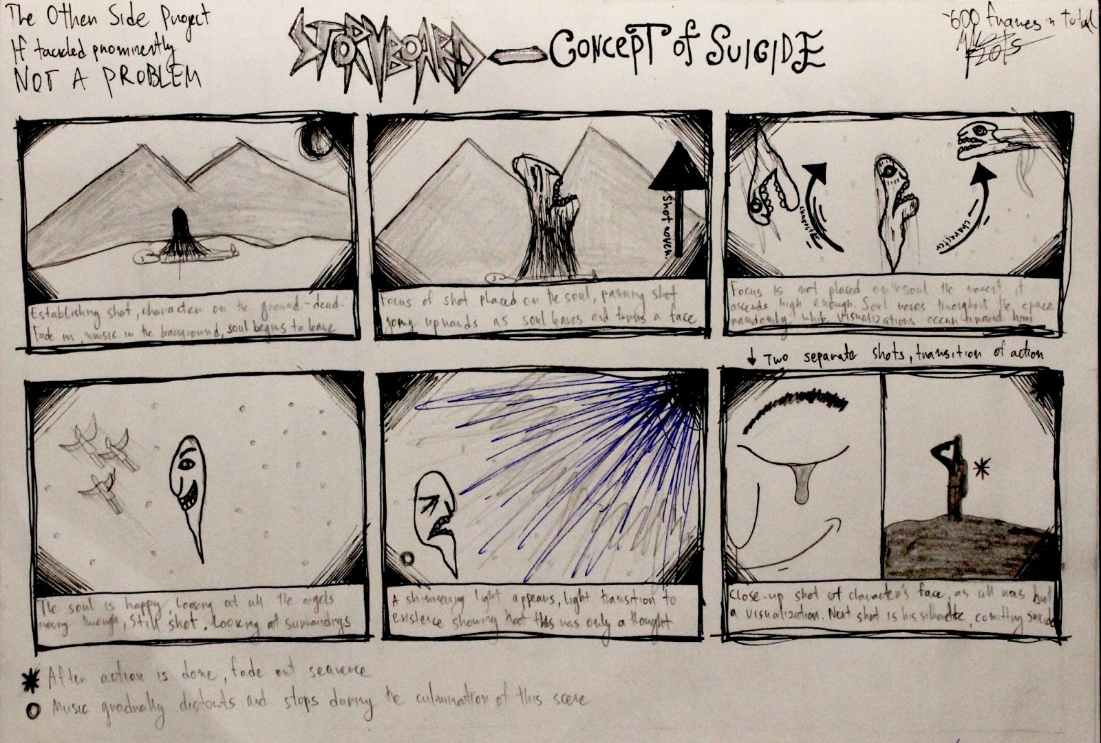
The Other Side - Developmental Stages: Storyboarding
Now comes the second part of the developmental process: the storyboard. It is the stage where one articulates their ideas in a more visual and meticulous manner: by drawing the story's most important still images. This is done with the soul purpose of giving an optical perspective of the future animation to the audience, but also to yourself as a reference. I drew the storyboards with the hopes that they are coherent and explanatory in terms of action, movement, and tone. Moreover, with adding arrows in the panels that guide the movement of the character or shot, I've added another level of organization, which is a useful storytelling skill I've acquired throughout this course. Thus, I chose two of the initial ideas I had and made two storyboards in total: one for the Concept of Suicide, and the other for the Concept of Wonder. By drawing two of the ideas I liked the most, I have now plundered into a difficult choice on which story to animate, what a quandary... One's existential, the other whimsical. One's depressing, the other uplifting. One tackles suicide's coping promise, the other a confusing turn of colorful events. I'll have to choose. Furthermore, in the storyboards general appearances of the characters of both animations are presented, as I shall now enter the realm of individual character and background design.

Animation Exercise: Flipbook Motion


Animation Project: Pendulum


Animation Project: Storyboard

 We were instructed to create a storyboard which was to present a nursery rhyme, however, with our own twist to the plot. I did "The Itsy-Bitsy Spider" and gave it an existentially-nihilistic warp. I intertwined the plot of "The Itsy-Bitsy Spider" with the myth of Sisyphus, who is cursed to push a rock up a hill for all eternity, embracing monotony and the misery of routine. By using the colors black and red, along with a sharp contour style of drawing, I was able to exhibit a more obscure and bleak representation of The Myth of Sisyphus by using the Itsy-Bitsy Spider as a symbol to produce an allegory. Furthermore, as the final and conclusive exercise of this project, every student was obliged to look at some of their peers' work and supply them with constructive criticism. For my storyboard, I got short, but concise responses which signify the responses I elicited; the kind that I wanted to see.
"Great commentary"
"I like the use of selective colouring!"
"I love your style and philosophical approach!"
"This shot (9th) is awesome!"
"Moody and abstract, textured and atmospheric, effective use of color, however, very scary."
Subscribe to:
Comments (Atom)