Sunday 26 March 2017

Applied Animation 2 - Week 8

Recording Zap's voice
This week has mainly revolved around the assembling of the animatic with gathering and creating all of the necessary assets for it. Firstly, me and Luke rearranged bits of the content-driven narrative so that we discard the unnecessary parts and add in the character interactions. Once we had done that, we booked the recording studio for two days per 2 hours, 4 in total, seeing as we were unable to record everything during the first take due to performing voice tests. In the meantime, we simultaneously finished off the remaining animatic panels we needed to do so that we may have them ready in time for the final assembling of the animatic. Furthermore, as I had self-assigned myself to create the background ambient music, I had started working on it on Tuesday and kept adding to it and refining it everyday. By using my guitar with a digital direct connection through an interface, I messed around with all sorts of VST effects and filtered the organic sound so that it may exert a sci-fi cosmic vibe of ambience. Working in Mixcraft I found is a lot more effective for ambience pieces than in Ableton, partially due to the already pre-built VSTs that filter a grand proportion of the natural sound, making it seem as if it is almost purely synthesized. Seeing as both of us stuck to the schedule of the Gantt chart, we had everything ready for Friday where we spliced together the animatic. We ran into several conundrums while we were compiling it, one being that the totality of the narration was FAR too long - approximately 5 minutes. Thus, we removed all the unnecessary bits that added nothing to the flow of the animation and purely existed as cosmetics, which indirectly also complicated the flow of the narrative due to their verbal complexity - a mistake on my end. To narrow down the length even further we sped up the voicetrack - from 100 to 111 percent - which coincidentally gave it an even more alien-ish touch-up. We found that the soundtrack I produced fitted the animatic perfectly, and even more so had a moment where it synchronized with the movement - something that I can envision to happen in the actual animation. We interchanged in the making of the animatic so that we may simultaneously focus on other projects as well - I did the initial arranging, Luke did the shortening down, I did the sychronization and sound arrangement, and Luke the final touch-ups and effects, in that order. We are quite proud of the animatic although I believe that it is far from perfect, which is a perfect opportunity to raise questions from fellow peers and absorb their feedback on how we can modify the animatic or reflect a change in the final animation itself.


Animatic frames from the remaining panels

Saturday 25 March 2017

Responsive: Collaborative Practice - Meeting The Deadline

The collaborative project is finished. We have successfully met the deadline of the YCN Orchard Pig brief. For the final boards, having our graphic designer Alex's skill in layout, we assembled the boards in a way that it reflects the website of Orchard Pig. Considering that all the designs called for this final synthesis of the application, we wanted it to be just an extension of their already well-designed website instead of something revolutionary. Every asset that I had made for the application was altered in some way so that it may fit the layout perfectly. For example, when we took a look at the size of the boards I realized that some of the graphics for the buttons I made were far too detailed to be identified on-screen when shrunk to their respective size, which is why we removed the pig beneath the question mark for the "Info" button. The only asset that remained unchanged was the maps for the application which remained as simple as they were made. Unfortunately, Tom ran into several problems during the texturing process of the cider tap, which left us using the sketches instead. Although I am aware of the potential and limitations of the 3D medium, I believe that Tom could have found a way around the 3D model where the boards lack a bit of contextual consistency. Overall, I had a fun time doing this project since it gave me thorough insight into commercial work of product design, as well as an interdisciplinary practice of collaboration. Another thing I learned was that people tend to have whole different working schedules that interfere with my personal one, so compromising is one of the most important skills a collaborator can acquire. I need to boost morale in a project next time for at times all of us were stagnating a bit with our work, since without morale no intrinsic motivation can form which is one of the most important driving forces of artists.


Sunday 19 March 2017

Applied Animation 2 - Week 7

This week consisted of planning out in foresight what we are to do over the Easter, as well as designing the animatic. Coming to that we first briefly looked over the Gantt chart to roughly deduce what needs to be done before Easter, during, and after, where we booked the recording studio for the 21st of March to do the draft version of the narration. Once deciding on the layout of the animatic, we divided the panels each of us are to do based on the storyboard - it has 6x6 panels, making each of us make the animatic frames for 18 panels in total. Every movement that needs to be emphasized shall be annotated with arrows when we will compile the final piece, which would be next week where most of our time shall be devoted to Applied Animation - Responsive modules finish up. With half of the frames already done for the animatic, we've produced work faster than expected which might give us more time to focus on the cosmetics of the animatic so that it is much more understandable and easy to follow. I feel that during our presentation we did not delve much into the story as the storyboards were presented but not covered properly with context.


Responsive: Collaborative Practice - Finalization and New Graphics

As we are reaching the end of our collaborative brief, my assignment was to finish up some more graphic designs of the buttons within the OrchApp. As we felt that the initial and second version of the game logo I designed to be inconsistent with the vibe, I set out to create another final version that is both simple and authentic. I figured that one good way to execute this is to synthesize classics with countryside games, and seeing how the games within the app mainly rely on a brush of luck, I used two symbols of luck from those two different concepts - a roulette token and the horseshoe I already had made. Tweaking the logo a bit, I found that simplicity would suffice much better since it gets the message across sturdily. Having this finished, for the "Story Time" game of the games section three graphics of random items were necessary to further explain the idea. Thus, we simply settled on a banana, a toilet, and shirt - completely random as the game suggests. Just simple graphics is all is needed for this section, monochromatic to match the buttons. This whole endeavor made me explore the parameters of Adobe Illustrator more as I haven't been using it enough, considering that any graphic design is needed of vectoring and image tracing to assure optimal quality. First everything in Photoshop rasterized and then traced in Illustrator. I have kept the .ai files as well for any such situation where I would need to export them as something other than .pngs.


Sunday 12 March 2017

Responsive: Collaborative Practice - Crit Session

The crit session proved to be quite constructive as it allowed fellow interdisciplinary peers to give each other advice, as I did to others, as they did to us. Nevertheless, the feedback that we got was positive and thorough, as they gave us brief drinking game suggestions that Alex and Tom built upon for the final mock-up. Unfortunately, there wasn't much criticism for my end of the work other than the possibility of production costs outweighing if the box is made from rope. However, I do believe that it is the necessary aesthetic for the countryside vibe, even more so, I asked one of my father's friends that works in container production about this dilemma. He gave me insight on the fact that it does not cost significantly more to replace a cardboard holder with a rope as long as it is for massive production where arithmetically the price of the rope will surpass the excess cardboard due to the lesser price on macrobuy (in bulk). For now, post-crit, I have redesigned the Games logo so that it would reflect the social aspect of games, not the virtual one as the joystick might connote. This decision was instilled by the crit, but rectified by my partners' feedback on my designs.

Applied Animation 2 - Week 6

During this week we solely focused on finishing our work intended for the presentation, as well as the presentation itself. Not much has been going on other than assembling the presentation with all our collective progress, preparing the notes, and dividing the time of speaking each of us will consume to fit for 20 minutes. Furthermore, we restructured our organization sheet in a Gantt Chart, which prove to be quite an effective tool in organizing and managing time when working with a partner - much better than what we had initially utilized. For it we collected pictures of the ideas we had initially while brainstorming, pictures of Greene's website where most of the research was eviscerated from. Considering that both of us had a lot of work from other modules inbound we decided that this week would solely reflect our skills on organization and presentation for it is a skill that PPP too desires us to develop. The biggest emphasis of ours was placed on the character designs for our documentary is quite relevant on the narration and interaction of our two very distinct characters that we spent quite a lot of time refining and designing. In a way, I love how they've gotten quite sentimental that they reflect our styles and how we've been able to merge them into a synthetically aesthetic blend for the purpose of harmony. Finally, we are to embark on making the final animatic and starting our animation individually during the Easter break, all to come together as we work on it together full-time during our final part of this year.

Friday 10 March 2017

Responsive: Collaborative Practice - Final 6 Pack and Pig Hoof Pint Glass

With Alex having his designs finished, I applied the UV map onto the box with it successfully turning out. Furthermore, I used a royalty-free online wooden board texture for the insides and the bottom of the box as they don't require any design in particular to get that country-side vibe we have felt that Orchard Pig are going for. Tom showed me how to make high resolution renders for the final export for presentation with the skydome lighting and Arnold in contrast with my badly renders for the pre-finished mesh boards. In order for the product to be conceptualized properly, I had to play around with the texture of the bottles and how they reflect the lighting along with several tests of the intensity of the skydome light itself. As for the pig hoof pint glass, it took me quite a while to find a good material for the mesh of the glass so that it can render out the shape properly. I tried looking at online tutorials on how to simulate glass, however, was unable to execute them due to a range of problems. After all, the shape and presentation of the design is my priority and I believe it is something I achieved with the AiUtility shader, where I put the logo on afterwards so to have a general perspective of how it would look. Overall, I am extremely happy with these designs and I believe that they relay the point of sale aspect of the brief. However, I am still open to tweaking anything based on my partners' feedback.


Responsive: Collaborative Practice - Application Idea and Synthesis

We felt that each individual effort had no point of unity, and thus, decided to circle it all together with one final merging piece of the project. Initially, I was thinking of a brief animation to satisfy the point of sale parameter of the brief, however, Alex thought of a brilliant idea, indirectly taking the non-hierarchical role of art director of this final endeavor: a mock-up application that will both use our designs and introduce new perspectives to loyal customers. The main points of the application were: navigation through GPS to show where the nearest Orchard Pig pubs or points of sale are, a point-award system for loyal customers, and a list of socializing drinking games. With this in mind, all three of us sat down in one session to outline the parameter of this application idea and structure it in a functional way: how it's gonna work, how its layout is going to be roughly, and to divide the workflow evenly based on our skills. As we discussed, I took the role of doing the Map section's content, the graphics for the buttons, and the text for the explanation of every section within the application, where Tom shall do the Milestone (point system) section's content and load-up screen, with Alex rounding everything together with layout. Furthermore, we wanted to preserve and retain Orchard Pig's already powerful design and style based on their website so that there is a consistency between the brand and its points of promotion. Even more so, we discussed the time remaining and decided to pick up the pace, with me already having the graphic buttons finished with the Map's content section coming next. Once the mock-up conceptualization of the application is finished, we will organize together everything in a Pitch Bible-style board for presentation to both the live brief and the module.
Initial notes

Monday 6 March 2017

Responsive: Collaborative Practice - Ideas and Work Discontinued

With our time running out but our work pressing on, several ideas we had were discontinued alongside some work casted aside. As mentioned in my previous post, we were considering designing a pig mascot to envelop the mischievous demeanor of their free-spirited brand. However, due to our team discussing their already firmly-established brand design and how it fits their point of sale as well as their spirit, we decided to discontinue the initial pig design I made - the aesthetic of the style of the brand and my drawing does not match. Instead, innovation being evolutionary and not revolutionary, everything we've synthesized so far has been building upon the foundation Orchard Pig has already set, taking into consideration the elements pre-packed with their brief (which I believe is a hint that we are to build upon what they already have). Upon this point, conceding from today's meet up with my team (with Tom unfortunately not joining us in person due to booking agents' inconveniences), we decided to cast away the animation and finalize this project with an app (named OrchApp, for now) that displays all pubs with the cider, that gathers points together to reward loyal customers with the pig hoof pint I designed, and tho invigorate the users with socializing drinking games. With Alex briefing us this idea, once he explained it into detail, I immediately loved the synthesis it would provide with our separate works being blended into one. Alex Zorita has taken the art direction role by accident in this project, which is something I haven't experienced in a team before - being guided by a fellow practitioner. I also had a concept of a pig-ear bottle opener that I don't believe I will have the time to make, ergo, discontinued.


Sunday 5 March 2017

Applied Animation 2 - Week 5

Yet another structuring pre-production week before the serious animating stage kicks in. This week I solely placed an emphasis on the development of my character after I picked out which one I'd like the most - a decision made with my partner's assistance. Nevertheless, once I picked my character I started doing color schemes to have a general overview of how the colors would interact and whether they'd be complementary, too tense or not, or saturated enough. For this I used the traditional drawing I made of the character, and once I experimented a bit with one of the patterns digitally I started drawing my character in poses to practice digitally drawing him. Since never before have I used roughs in 2D animation, this was a perfect time to practice since my character is not something I can draw straight away consistently. I found out how difficult it is to retain consistency once you are set on one character since everything previously was just different renditions of a singular character. After several tries and changes while redrawing him, I insisted on removing the headband and placing the signature eye as a badge on his lab coat since it simplified the drawing process when compared to an animation standard - doing the headband also made me lose a sense proportion on his head lump. Furthermore, I removed the ear antennas (unnecessary since his dome is flopping) and made his head more of a rasta's dreadlock hat form with significant overlapping, which also made him more in depth. I don't believe I'm going to name this character since he's one of may, but I decided on calling them Zappians due to their loyalty and submission to the god Zap. I feel that we may have drifted a bit away from the main course, however, whenever I remember the script and the researched analytical but visual presentation of the topic I feel it is quite necessary to add a bit of character comic relief since it gives the audience a bigger interest and appeal to watch it and learn. I want to call it being interactively didactic since it is to retain your attention with entertainment. I'd say a rather productive week considering I've been doing 2 other modules simultaneously whereas my artwork and practice shall kick off for this module in full blast once my Responsive module ends which is quite soon.


Thursday 2 March 2017

Responsive: Collaborative Practice - Work Division and Progress

Me and Alex were insistent on working in a trio, thus, searched out to find a third partner. From my animation course, due to his adept 3D modelling skills, Tom Horner joined our team and the first thing we did was divide the workload and decide who was to do what. Since we wanted to submit a pack of ideas and models to meet the briefs criteria of Point of Sale, Innovation, Packaging and Point of Pour, we spread out everyone's ideas, synthesized them, and decided which are to be carried out and which shall remain only ideas. We decided that (based on the provided time) we will model a: custom pig-hoofed cider tap, pig-hoofed pint glass, countryside vibed 6-pack, engaging pig-shaped rocker. We had plenty more ideas that we either casted aside or sourced out due to the limit placed upon us - time management keeps our zeal leveled down so it does not interfere with the execution. Nonetheless, we also considered a small animation as a drawing point of sale which we might compile if we manage to execute the previously aforementioned ideas. Laying out our individual skills is how we divided the workload where I was assigned to model the 3D 6-pack and the pint for the time being where we assigned each other a personal deadline of the 5th of March. I've had significant progress so far, however, the synthesis of our group called for a much more spontaneous endeavor, which is something I simply could not impose my pedantic nature in terms of work upon. Unlike Applied Animation, I did not opt for a organization sheet for this project, which is something that I believe lacks a small aspect of professionality - note taken for next time. We went through many spontaneous changes in our practice, where Alex (the graphic designer) would make use of my UV Maps for the 3D models in order to design the layout of the packaging. Initially we were considering making a pig mascot/character for the brand, however, decided that we shall keep that aside once we have something firm created. Furthermore, although I did make a design on the character, Alex stated that it doesn't align with the aesthetic of the packaging. Nonetheless, for the time being, my progress seems promising as all of us have stuck to our respective assignments and will mix them all together in a week's time.

6 Pack Design and Hoof-Shaped Pint
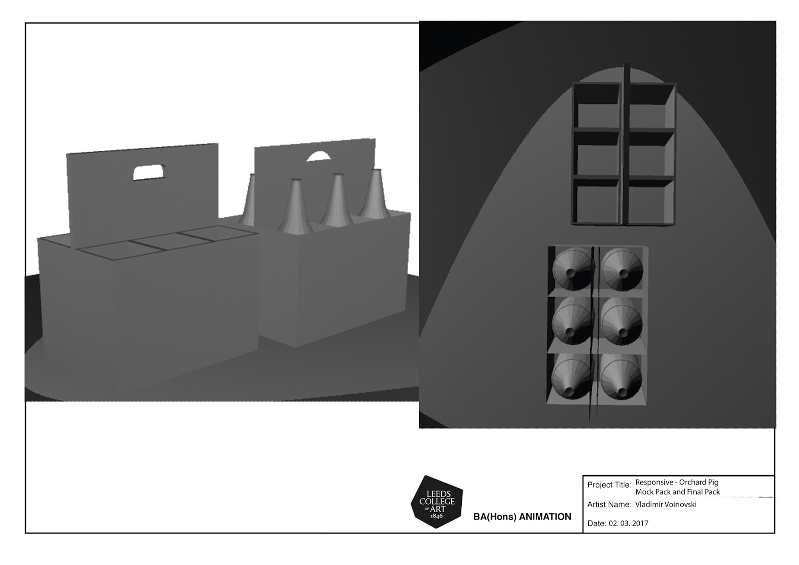
For the 6 pack, there was initially a holder, however, in order to make it more countryside-ish we got an idea for it to be harnessed by ropes, having me remodel the box. In the very first draft version, since I agreed to do 3D models due to me wanting to further develop my inconsistent 3D modelling skills with an external motivator that would push me to do so, I started making them with planes bound together. Unfortunately, I got rather frustrated as to how Maya works, having me contacting Mat to show me how the tools function. Based on that, we created a mock box for the 6 pack and in doing so he also taught me how to UV map, increasing my Maya skills even further. With that, I redid the box on my own using the technique I was shown, only making it much thinner. Once I got that narrowed down, I started doing the rope adjustments etc, along with the hoof-shaped pint. Messing around with it got me to understand how to work eliminating faces, how to bevel edges, and how to extrude vertexes. For now, I'm settling on modelling both of these to the max before I learn how to convert the mesh to adapt glass as a matter and before UV mapping the box, which is something Alex is designing based on the UV maps that I was taught how to make. Furthermore, so that he may understand how the box was unwrapped we placed numbers on the original uv for the pack, added it to the model, and then took screenprints to see how the numbers envelop around the box.