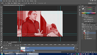
Rushing to meet the strict deadline, I continued making my animation and simplifying assets and details along the way. With the background being quintessential to both the premise and the color scheme, mid-way through animating the contours I stopped and started thinking about the medium of the background. Nevertheless, with time against me, I took pictures of my house to instill a realistic festive atmosphere that would coincide with the style of the animation. Furthermore, I figured that I can easily change the tint of the picture which would be compatible with a contour-trace stylization. The essential part of the animation is Karl Marx's presence, thus, I grabbed a picture of him and edited out the contours so that I may reuse him for every frame. Editing out his eyes so that I may animate them frame by frame gave the animation's cut-out nature a bigger vivacious and lifelike appeal which perfectly matched with the 15 fps deliberate lagginess of the movement. For his mouth I referenced my friend's mouth movements for every frame and tried to recreate it with simple black shapes. I thought about greenscreening my mouth saying the lines to put it on top of Marx's head, but given the limitations of time and the incompatibility of styles, I casted this aside although I'd love to use it in a future animation. One unplanned fit was Marx's shaking head since I duplicated and rearranged it for every frame with no precise guide, but only through reference - I found that this added to the glitchiness of the animation. Casting this aside, a problem arose while I was trying to import the Photoshop files into After Effects, thus, I had to export the animation without the background in transparent GIF sequences so that I may take them into After Effects. There, I compiled the final outcome where I merged the background with the animation. It seemed a bit flat as it stood dormant, so I added a Wiggler effect to it in order to eliminate that stillness. Moreover, since the original background of the reference video was slightly moving hence the camera was held in hand, this one had to as well for the sake of compatibility.
Wednesday, 28 December 2016
Responsive - 11 Second Club - Continuation of Production
Rushing to meet the strict deadline, I continued making my animation and simplifying assets and details along the way. With the background being quintessential to both the premise and the color scheme, mid-way through animating the contours I stopped and started thinking about the medium of the background. Nevertheless, with time against me, I took pictures of my house to instill a realistic festive atmosphere that would coincide with the style of the animation. Furthermore, I figured that I can easily change the tint of the picture which would be compatible with a contour-trace stylization. The essential part of the animation is Karl Marx's presence, thus, I grabbed a picture of him and edited out the contours so that I may reuse him for every frame. Editing out his eyes so that I may animate them frame by frame gave the animation's cut-out nature a bigger vivacious and lifelike appeal which perfectly matched with the 15 fps deliberate lagginess of the movement. For his mouth I referenced my friend's mouth movements for every frame and tried to recreate it with simple black shapes. I thought about greenscreening my mouth saying the lines to put it on top of Marx's head, but given the limitations of time and the incompatibility of styles, I casted this aside although I'd love to use it in a future animation. One unplanned fit was Marx's shaking head since I duplicated and rearranged it for every frame with no precise guide, but only through reference - I found that this added to the glitchiness of the animation. Casting this aside, a problem arose while I was trying to import the Photoshop files into After Effects, thus, I had to export the animation without the background in transparent GIF sequences so that I may take them into After Effects. There, I compiled the final outcome where I merged the background with the animation. It seemed a bit flat as it stood dormant, so I added a Wiggler effect to it in order to eliminate that stillness. Moreover, since the original background of the reference video was slightly moving hence the camera was held in hand, this one had to as well for the sake of compatibility.
Subscribe to:
Post Comments (Atom)
No comments:
Post a Comment