 |
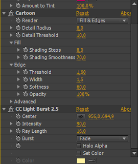
| Effect values for background effects |
As the deadlines are approaching, this week was the proper time to start rendering out the scenes. With the final touches of animation being done and some finesse in details being added, the final renders have begun. By carefully dividing the workload for composition, me and Jay created a schematic which outlined and numbered each scene (based on the storyboards), giving us insight on which scene am I to composite and which one he is to. We got together, worked on separate scenes together, and exchanged every necessary asset (I gave him the bottle and syringe, he gave me his pills, lighthouse, etc.). I believe this worked quite efficiently since it speeds up the process of rendering as well as indirectly halving my workload (me being used to compositing everything fully since I haven't collaborated before). Nonetheless, as we got to these final renders, we made some changes with small details of the animation. One such detail is discarding an unnecessary scene (scene 13, by chronology) due to the additional animation that had to be done and the minimal effect it has. Seeing as that scene is in profile, it would mean that Jay would have to draw a new upper rig, which is too much work for such an almost non-existent effect. Another example would be the compromise that me an Jay got into: completely discarding the red pill asset I made. The reason for this is the visual flaw in the mise-en-scene with its placement - the red pill does not blend with the backgroung due to its outlined style and color, however the blue one that Jay made does completely. Although I made that asset, for the sake of the animation I also decided to ditch it and replace it with the blue pill in every scene that I have composited priorhand. I recall there being a lecture where it was stated that collaborative animators must sometimes discard what they hold dear for the sake of the resolution of the animation, which is what I did here. Other than these significant changes on my end, I was just adding small details like wave warps, subtle blurs, and aesthetically-appeasing effects to elements such as the background, where at the beginning of this week I had given Jay all of the values and effects that I had used for every single element so that he may replicate the aesthetic for the sake of consistency when compositing his respective scenes. I had also found out that some of my scenes had an incorrect aspect ratio, something that I would have omitted in renders if Jay had not been assertive in checking all the settings beforehand, something I thanked him for dearly. Finally, with us choosing that we will render in TIFF format, both with the same quality and adjustment settings, I possess high quality pictures of some of the finished scenes which I can easily remove/modify when compositing the final animation in Adobe Premiere - I learned that it's always best to render in TIFF or PNG sequences.
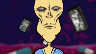
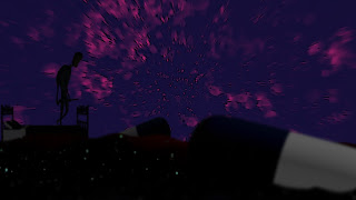
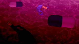
FINAL CRIT SESSION:
I was quite invigorated by the insight I got from two of my peers, most of which reflected upon the intent of my character, background, and music coming across. Considering that I had two music tracks (which I personally made) to choose from, both of my peers agreed with me in choosing the more eerie one. I was also elated to hear that my character's personality could be inferred by his appearance. One thing I was told was to keep on animating since my peers weren't able to see much background motion from what I showed them (which is when I still did not animate the water or the assets). Perhaps this can be taken as criticism for speeding up things the next time I have a crit session in order to give the assessors more depth for the sake of consistent criticism.


No comments:
Post a Comment