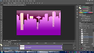
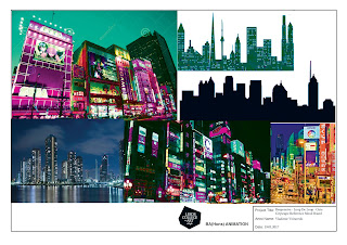
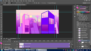
 I shifted my focus towards the background as Grimes' movements were nearing completion. Starting with the foreground and working my way towards the background, I accustomed the layout to the Rule of Thirds to have a natural and complete feel of mise-en-scene. However, at first I was not sure how I was going to create the layout of the layers, thus, I created a reference board in order to help me guide my thoughts. By scouring the internet for cityscapes I landed onto different perspectives of the - silhouettes, one-point and two-point perspectives, tilted and skewed perspectives, etc. As per usual, I drew the contours of the buildings in black and then colored them within, but found out that this did not quite match with the highly blooming and cotton-candy like colors. So, in a repair attempt I used the magic wand to select the contours and dye them a darker shade of the color of every respective building and discovered a new aesthetic - since the magic wand tool doesn't FULLY select the outskirts of the contours, the 1 pixel ends remain black, giving it an inner outline. Reaching to the background, I made a city silhouette based on geometric forms and then drew lights with a separate brush. Then, a sudden idea outbursted where I would add looping radiant lights moving horizontally to make the background more lively, showing me that there will always be unexpected spontaneous ideas that would sprout out of experimentation as one is working on a project. Alongside this, I had to later go back and patch up some of the buildings' blank spots left by the magic wand coloring. With the tons of videos of animation techniques and research I've watched these past weeks, one on how Disney has recycled animation in order to spare time and finesse in future animations gave me an inspiration to use old assets from past animations into this one. Although it is not much, I used an old grain gradient I had made for the previous module (Character & Narrative) for the sky, where the only difference was me changing the hue of the colors to match the palette of the background. Once done, I shall unload every separate layer in After Effects to do some technical animation to make it more vivacious and not still.
 |
| Recycled gradient for background |
No comments:
Post a Comment