Wednesday 28 December 2016

Responsive - 11 Second Club - Continuation of Production


Rushing to meet the strict deadline, I continued making my animation and simplifying assets and details along the way. With the background being quintessential to both the premise and the color scheme, mid-way through animating the contours I stopped and started thinking about the medium of the background. Nevertheless, with time against me, I took pictures of my house to instill a realistic festive atmosphere that would coincide with the style of the animation. Furthermore, I figured that I can easily change the tint of the picture which would be compatible with a contour-trace stylization. The essential part of the animation is Karl Marx's presence, thus, I grabbed a picture of him and edited out the contours so that I may reuse him for every frame. Editing out his eyes so that I may animate them frame by frame gave the animation's cut-out nature a bigger vivacious and lifelike appeal which perfectly matched with the 15 fps deliberate lagginess of the movement. For his mouth I referenced my friend's mouth movements for every frame and tried to recreate it with simple black shapes. I thought about greenscreening my mouth saying the lines to put it on top of Marx's head, but given the limitations of time and the incompatibility of styles, I casted this aside although I'd love to use it in a future animation. One unplanned fit was Marx's shaking head since I duplicated and rearranged it for every frame with no precise guide, but only through reference - I found that this added to the glitchiness of the animation. Casting this aside, a problem arose while I was trying to import the Photoshop files into After Effects, thus, I had to export the animation without the background in transparent GIF sequences so that I may take them into After Effects. There, I compiled the final outcome where I merged the background with the animation. It seemed a bit flat as it stood dormant, so I added a Wiggler effect to it in order to eliminate that stillness. Moreover, since the original background of the reference video was slightly moving hence the camera was held in hand, this one had to as well for the sake of compatibility.


Friday 23 December 2016

Responsive - 11 Second Club - Late Beginnings

Inconveniences with Wacom Tablet
As this month has been gradually flowing, I have experienced a myriad of inconveniences that have jeopardized my stable and sturdy practice. I am set on creating an animation for the 11 Second Club brief, which ends when this month concludes. Following my planning on how to tackle this brief during the holidays (as I have many other obligations inbound, as well), I ran into one debilitating problem: my computer broke down due to hard drive problems. Immediately I took it to be repaired, and was amazed at the level of improfessionality at the hand of the computer repairers I sent it to as it took about 6 days for it to get repaired and for all of my files to get transferred. After it was fixed, my computer kept shutting down with a "blue screen of death" every time I attempted to install my Wacom tablet, and after a few days I resolved the issue - the driver for the USB 3.0 port (iusb3xhc.sys) was preventing the tablet from getting properly installed since I do not have a 3.0 port. At these times, my mind was clouded as I was getting frustrated and behind on the project. Luckily, I fixed it, and in doing so I instantly began the brief. I was not expecting such a drawback, and this has taught me to always have a plan B secure for anything (especially an external hard drive for not losing my files and animations). Nonetheless, I mapped out every day I had left for animating (I started on the 20th of December, expected to do so on the 10th), and figured I can tackle the brief, although it is going to be a close call. With not much time left, I settled for rotoscoping as it would be a straightforward technique. Revisiting my structure of ideas from before, I reviewed the parameters and rules of the challenge where it was specified that the content must not insinuate offence nor must it pertain sexual or explicit content. Furthermore, I had been thinking about the content and, reminiscning about COP and propaganda with the consideration that it is Christmas, the color red stuck in my mind. Thus, I formulated a story: Karl Marx is Santa Claus, proceeds talking to an elf where the end justifies the "one more thing" piece of dialogue where he looks at a list of Christmas toys that need to be manufactured as the only unchecked one is "seizing the means of production". Relevant to internet assembled pop-culture, I beleive that this is a harmless piece of semi-political comedy that will meet all of the requirements of the competition. I filmed myself and a friend lip syncing to the soundfile provided with several attempts, and then synchronized it with the soundfile in Premiere so that I may have a coherent piece to rotoscope without doing any unnecessary additional drawings. However, I exported the video in 15 fps in order to lessen my workload and to add an aesthetic that will consolidate the line boil. In other words, given the inconsistency of line smoothness in every frame, 24 or more fps would be too impetuous for this style of animation. Furthermore, I figured that the natural color of the characters would be best suited, thus, I am editing out the background manually with every frame where I will use different layers of the tinted footage so that the red color is dominant. As for Karl Marx, I will use several images of him to rotoscope so that there is a dichotomy between the characters so to instill a hint of peculiarity.

Thursday 8 December 2016

Animation 1: Character & Narrative Weekly Summary 10

Premiere Composition - Sound Keyframes and Editing
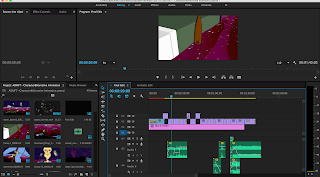
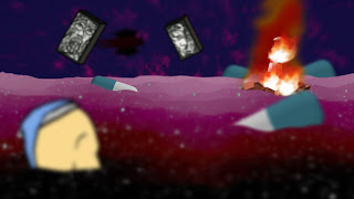
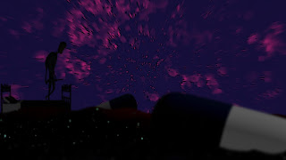
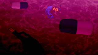
This week was arguably the most productive one in terms of work per day completed. It was a week jam-packed with composition, sound placement, greenscreening, alteration, planning, structuring, and last but not least, rendering. I must say, it was the most productive I've ever been, however, this hectic endeavor could have been avoided if me and Jay were to create a schedule in order to disseminate the workload effectively and equally, hence the previous week we stagnated for a bit. Nevertheless, this week has been a prolific success since we made the animation 2 days before the deadline, giving us time to check for any possible modifications and to articulate ourselves through this post and the evaluation. Upon dividing the scenes, this week consisted of rendering finished scenes and completing the compositing for the final ones. Because of inconsistent time planning, some modifications were made. For example, the scene where the lighthouse collapses features Jay's character flying through the air instead of ascending before his eyes. I composited this shot using the succubus and a pen-sketched path in After Effects, and in order to maintain consistency of the environment, referred to Jay's shots of the same space. Namely, the position of the pills needed to be identical to that of Jay's shots in order to avoid spatial confusion. Since we required to interchange assets, bobbing through flash drives, we used some alternatives that I shall consider beforehand in the future. One such endeavor would be the motion of my character in Jay's scenes which I composited with a red background in order to have it greenscreened through Keylight, since the other plausible way would be to transfer every single asset used in my After Effect projects, which is a really tedious task considering all my files were scattered all over my desktop (which is a lession in pedantry). I changed the export of the silhouette telescope scene due to Jay's output with him saying that it is too dark and vague in visuals, something I agreed with. Thus I changed that shot by adjusting the brightness in every consequent layer, making it fade from lightest in the foreground to the darkest in the background. Once all of the renders were done, me and Jay sat down to composite the animation, and in doing so made a few aesthetic additions to the finesse. We found that the way we had it composited differed from the animatic in some instances, thus we tried assembling the scenes to match the animatic but failed to do so since we have merged two scenes into one - noted. We added white visual noise to every shot in order to give it a subtle color adjustment, whereas we added my stop-motion ink animation (the one that's used as the background space) at the beginning with a fade to give off an early sense of eeriness in the audience. While Jay created the ending title with After Effects, I created most of the sounds for the animation since that's where one of my intermediate specialities reside. I recorded noises that my character makes, as well as the exhaling of Jay's succubus. Other than that, I generated and synthesized the rumbling of the lighthouse through adjusting the sound of me shaking a table with reverb, in order to flush and muffle it so that it seems that it is cast from a distance. Going back to the soundscape, I mildly altered the gains of every channel (every instrument) so that it does not pertain a discrepancy in loudness. The rest of the sounds I downloaded from a freesound.org, some of which I altered to fit the cues (such as reverberating the water splashes). I assembled all of the sound effects based on visual cues so that they tie in with the narrative, augmenting the flow of the scenes as well as their transition. I did this by keyframing gain drops and rises pinpointed to the exact frame where one scene ends and another begins, as well as fading in and out some sounds. However, despite all of this, I constantly asked for Jay's input and opinion on the soundscape, something that had proven to be both constructive and didactic. The final render was done on Jay's macbook since mine has insufficient RAM for Premiere composition and rendering, lest we desired to have it respond slowly every 5 minutes. Alas, the journey is over. We have persevered, learned, and purged into making an animation I am proud of. In comparison to my previous work, I can witness a drastic improvement in drawing, composition, and animation in general, whereas I can say the same for Jay. All in all, I believe that this was a thorough, if not meticulous division of workload as we compromised during the entire journey just to make sure that we get our even share of work - proving to eliminate possible obstacles and unwanted predicaments.

Adrift - https://vimeo.com/194840201

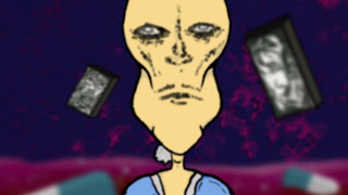
Succubus in the background

Wednesday 7 December 2016

Animation 1 Study Task - Strike a Pose

Relaying emotion is one of the most important techniques that an animator can have in order to drive the diegesis of the narrative. After all, animation is a method of storytelling just like film with all the same parameters only manifested through different techniques. I believe that with this study task I got to revise Maya since there was a possibility of forgetting everything I had learned about it last year, considering I do plan on doing at least one full animation in Maya in the future just so I can see the experience. Nevertheless, I consulted last year's notes on Maya and some of my peers into reminding me about Maya's tools, shortcuts, and workspace so that I could have full control of Moom and all of his controllers. Quite a structured task, I chose the emotions surprise, happiness, bravado, confusion, and envy since I thought that these 5 are the ones that can be most effectively portrayed by a character in a still image. For example, I find that anxiety and timidity can be thoroughly connoted only by an animated character, whereas it would be easy for those emotions to be misinterpreted in a still image. Anxiety manifests differently from person to person, whereas timidity is based on body language plus vocalization - based on what a man says, timidity can be inferred. Nevertheless, choosing these five emotions was not absolute, since I initially tried doing tiredness and exhaustion, but could not get them right in photographic reference, so I scrapped them. As I started posing Moom, it took me less and less time for every consequential pose while I got the hang of Maya yet again. I did not find the facial controllers difficult at all, and also realized that the position of one's eyelids do play a big role in emotion in relation to the position of the pupils. In 2D animation that is manifested through the shape of the drawn eyes, where with Moom it was about the eyelids. For example, for envy, it was extremely necessary to shape Moom's eyelids a bit closed, otherwise the emotion seemed dry and stiff. I followed every reference image to the bone except for surprise, where I thought that a sense of awe in the surprise gave off a more natural appeal to emotion. Nevertheless, I learned a lot from this study task although I was really tediously purging myself into doing it (which is why I did it now instead of the moment it was assigned to me just like the rest of the tasks).


Sunday 4 December 2016

Animation 1: Character & Narrative Weekly Summary 9

Effect values for background effects
As the deadlines are approaching, this week was the proper time to start rendering out the scenes. With the final touches of animation being done and some finesse in details being added, the final renders have begun. By carefully dividing the workload for composition, me and Jay created a schematic which outlined and numbered each scene (based on the storyboards), giving us insight on which scene am I to composite and which one he is to. We got together, worked on separate scenes together, and exchanged every necessary asset (I gave him the bottle and syringe, he gave me his pills, lighthouse, etc.). I believe this worked quite efficiently since it speeds up the process of rendering as well as indirectly halving my workload (me being used to compositing everything fully since I haven't collaborated before). Nonetheless, as we got to these final renders, we made some changes with small details of the animation. One such detail is discarding an unnecessary scene (scene 13, by chronology) due to the additional animation that had to be done and the minimal effect it has. Seeing as that scene is in profile, it would mean that Jay would have to draw a new upper rig, which is too much work for such an almost non-existent effect. Another example would be the compromise that me an Jay got into: completely discarding the red pill asset I made. The reason for this is the visual flaw in the mise-en-scene with its placement - the red pill does not blend with the backgroung due to its outlined style and color, however the blue one that Jay made does completely. Although I made that asset, for the sake of the animation I also decided to ditch it and replace it with the blue pill in every scene that I have composited priorhand. I recall there being a lecture where it was stated that collaborative animators must sometimes discard what they hold dear for the sake of the resolution of the animation, which is what I did here. Other than these significant changes on my end, I was just adding small details like wave warps, subtle blurs, and aesthetically-appeasing effects to elements such as the background, where at the beginning of this week I had given Jay all of the values and effects that I had used for every single element so that he may replicate the aesthetic for the sake of consistency when compositing his respective scenes. I had also found out that some of my scenes had an incorrect aspect ratio, something that I would have omitted in renders if Jay had not been assertive in checking all the settings beforehand, something I thanked him for dearly. Finally, with us choosing that we will render in TIFF format, both with the same quality and adjustment settings, I possess high quality pictures of some of the finished scenes which I can easily remove/modify when compositing the final animation in Adobe Premiere - I learned that it's always best to render in TIFF or PNG sequences.


FINAL CRIT SESSION:
I was quite invigorated by the insight I got from two of my peers, most of which reflected upon the intent of my character, background, and music coming across. Considering that I had two music tracks (which I personally made) to choose from, both of my peers agreed with me in choosing the more eerie one. I was also elated to hear that my character's personality could be inferred by his appearance. One thing I was told was to keep on animating since my peers weren't able to see much background motion from what I showed them (which is when I still did not animate the water or the assets). Perhaps this can be taken as criticism for speeding up things the next time I have a crit session in order to give the assessors more depth for the sake of consistent criticism.

Responsive - Considerations - 11 Second Club

As I ruminated before - the desire remains: I am going to enter this month's 11 Second Club. Based on the soundfile that I heard posted on their website, and given that I do not know which film it is from, I thought of several sketches with my own made context for the animation. However, the most important part I believe is the medium of choice, henceforth I am still in the experimental mentality of trying out new techniques I have never done before. Nevertheless, I must consider the limitations before me, both technical and situational, for the technique I had a fix idea on was traditional animation with watercolor. Because I am heading back to Macedonia with a limited array of luggage items, I have decided that I am not going to do watercolor for I do not have a lightbox home and am fearful of breaking one if I buy and choose to put it through travel. Thus, with stop-motion being a ubiquitous olden choice of mine, I was swept by inspiration as I was looking at one of my peers' animation - rotoscoping. I've never done full body rotoscoping which is why I wanna try it out with an awareness of possible mistakes - from which I will learn. Heading back to the dialogue, with it ending on a loose end ("there is one more thing...") I will be able to end my animation with an allusion or insinuation that is to foretell the following action through anticipation within the audience's mind, which would break the insipidity of most of the animations' visual context I've seen during the previous months of the challenge. Not discarding my desire for watercolor traditional animation, I believe that I will tackle the next animation brief through this technique, or perhaps will do so with one of the major collaborative briefs following the holidays.

Friday 2 December 2016

Potential & Limitations 5 - Blurs in Motion and Depth of Field

Motion blur in movement - insinuating fast movement
I have time and time again witnessed the amplification of smooth movement motion blurs evoke, and how they interact with different keyframe interpolation effects to create a satisfactory flow. Due to this, the moment my collaborative partner Jay pointed out the motion blur layers in After Effects, I was dazzled by the immediate embellishing resemblance to Kiszkiloszki's work. I started researching effective methods of using motion blurs accordingly, as well as looking and critically analyzing Kiszkiloszki's animation. Then, I reverted back to the Animation Survival Kit and the online derivatives of that knowledge, finding some relevant online sources and one extremely plausible GIF image that reminded me of one crucial benefactor - motion blur is to be prominent with fast motion. Considering all of this research, I applied motion blurs to Seth's fast motion, such as him flying through the air or arising submerged from water after being thrown. Seeing as those two scenes are in sequence, the motion blur would be more noticable and promiment, giving off the sence of rapid motion in the eyes of the audience. Diverging from this, I continued scouting the internet about blurs and started experimenting with gaussian blurs of the assets in every scene, only to find out that it gives off the depth of field illusion of distance, as well as the shifting focal point of the scene. So, having this in mind, I utilized the potential of blurs and added it to almost every scene. However, because it is a manual blur, the limitation is in being careful not to have inconsistent values between assets, for some are scaled from bigger images that would need more gaussian blurs for the same distance in effect - something I realized after several detailed looks at unsatisfactory renders.


Principles of Animation GIF - https://media.giphy.com/media/3oriOiLUqWXA9Rc7eM/source.gif

Subtle blurs for depth of field