Thursday, 27 April 2017

Responsive: Evaluation

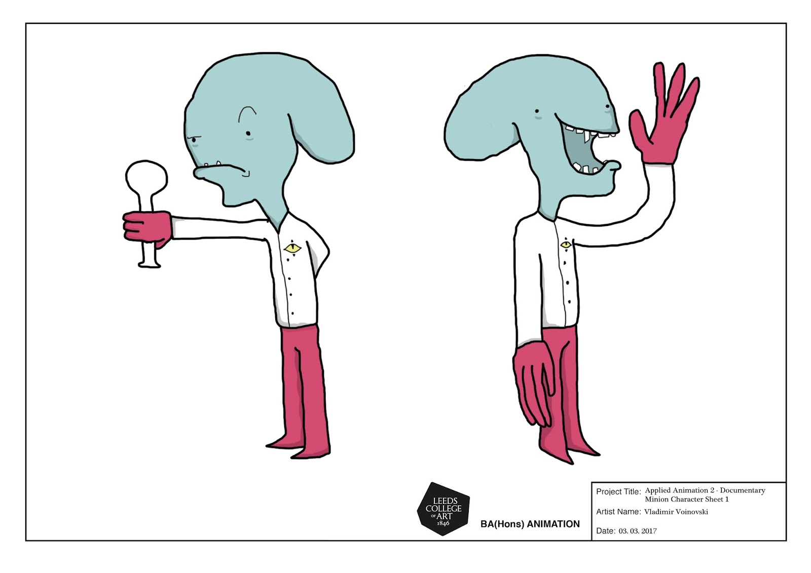
This module has been an interesting endeavor for me from several aspects including time management, style development, and improvement of practice. Although it was quite confusing as to how the module functioned, after the initial weeks I managed to understand its requirements and set goal so that I may respond in the most effective way. Furthermore, it thoroughly provided me with a flexible choice of both medium of art and requirements that best reflected my technique of practice. The most didactic part of this module for me was the Collaborative Practice brief that indirectly stressed out the importance of compromise and sacrifice of one’s own practice for the sake of the final piece. Additionally, the brief purged me into escaping my idee fixe of working within the parameters of my own study without expanding my horizons through experimentation. What I’m mostly thankful for was the professional demeanor of it that gave me insight into how working with collaborators would be in the near future, making me engage and learn more about 3D through the guise of envisioning the final outcome.

The module was coherently divided in three comprehensible parts, although I believe that the Project Report should have been made live much earlier as it did not provide us with enough information in relation to time remaining to resolve the entirety of the module. Furthermore, in terms of annotating our work, it was never clearly stated nor was it emphasized that we are required to present our works through individual text-including art boards hence much of my peers suffered a state of confusion and compulsion during the final days preceding the deadline. Considering the universal deadlines provided by both DNAD and YCN, I believe that the brief Collaborative Practice should have been administered an earlier beginning to provide us with more time to facilitate our works. Personally, I had a minor inconvenience with time management due to this since it was completely oblivious to the myriad of work we needed to produce for other modules at the time. Moreover, I believe that the module’s brief is not properly synchronized on both an interdisciplinary and structural level. In terms of interdisciplinary, the module in itself contains a predisposition that benefits Illustrators and Graphic Designers more than it does us animators from one simple viewpoint: their practice wholeheartedly emphasizes the expression through annotated art boards. However, in comparison to the latter level, this is minor. During the initial team-constructing session where everyone’s work was cascaded so that other respected creative practitioners may jot down the names of those whose work they admired there were several problems. We were told to leave out our names as the faculty had informed us that they would be projected during the screening. Unfortunately, they were not assembled on time by the course leaders and no amends were made to compensate for this nonprofessional conduct, leaving those that did follow the rules’ names to be omitted, diminishing the purpose of the event. Personally trying to amend this, during the presentation I vocalized a suggestion for people to shout out their names when their work appears, which was not supported or further encouraged by the tutors present; to amend for their mistakes they could have persuaded students to do this without feeling reluctant as they normally would.

On another side, the Project Report, Boards, and Developmental Blog overlap in some aspects, deterring us to engage wholeheartedly since every single one of us were repeating themselves during some part of our documentation – this needs to be reconstructed. I believe it is quite ironic and hypocritical to propagate professionality when there was a presentation that included two deadline dates for the Pitcha Pitcha slide hand-in on the actual presentation, for which I have physical evidence (I always take pictures of lectures), which naturally caused confusion in students which was voiced, only to be cast aside by one of the tutors as our fault. Finally, the module needs to set a bare minimum or a reference rubric for the Individual Practice in order to give students a rough conceptualization of the work they are supposed to do throughout the Brief in order to more effectively self-assign time management cues that will, at the end, benefit their practice more firmly. I witnessed several students being enshrined in perplexity over the quantitative weight of their individual practice which should also account for quality’s weigh on the scale.

Overall, the concept of this entire module is engaging, enticing, and stimulating for animators, graphic designers, and illustrators alike for I’ve witnessed many gaining pride about what they have created under said concept, however, it needs to be solidified and restructured in various aspects, ergo to be more professional and less chaotic in execution.

Responsive: Project Report


In order to collate my work in a professional manner the third and final studio brief asked for a textual annotation of all the learning processes I've gone through with the presentation of my final pieces. Furthermore, we were introduced to the online publisher ISSUU which served as a wonderful vesicle of presentation. Nonetheless, initially I was rather confused as to what was supposed to be within such a project report along with which topics I should brush upon. However, upon careful reading of the rubric as well as some tutor feedback and advice, I was aware of how this conclusive art piece is to function. In my project report I wanted to belabor the didactic benefits of the academic journey as well as the mistakes made to be taken into consideration for future projects. Overall, it served as a fantastic conclusion-like assignment that tied in together the highlights of my project so that I may use it to introduce others to my polished pieces instead of the developmental work throughout.

ISSUU Link - Project Report: https://issuu.com/vvoinovski/docs/vlad_report_final

Monday, 24 April 2017

Applied Animation 2 - Week 12

Utilizing squash-and-stretch by changing proportion
This week, as expected, has consisted of finishing up character animation to be ready for composition once we collate our work together. I have been mainly animating the portal scene where my minion jumps through a portal and then proceeds to come back. Thinking tactically, in order to eliminate any possible problems in foresight, I've devised how the execution of this scene will work: the portal will be a separate asset with a 50% feather mask so when the minion dives his body gets gently cut off. Meaning, for this raw animation file I need nothing more than just a simple movement with the portal being added later to the final cut. Alongside this, I've been finishing up animating small instances of the remaining pieces of character animation that I've started but had not yet finished - I completed the 9 universe types explosion scene. In this instance, as well, I started thinking tactically and replicated the same minion movements on the other side in order to spare time and connote the minions' hive mind personality and lack thereof. From this perspective, I decided that the entirety of all squash-and-stretch factors will be separately animated through a Mesh Warp modifier within After Effects due to its versatility and simple interface.


Monday, 17 April 2017

Applied Animation 2 - Week 11

Solely an update of the same process of character animation during this week, as well. The holidays have taught me an important lesson which is time management under underlying circumstances, where I have attained a routinely habit of animating in the morning - the only window of opportunity before the hustle and bustle of my day away from my computer starts. During this week I got an additional headway with my character, managing to start and nearly complete the animation for the minion's pouring in the vat and computer tapping, which are both animations that would be duplicated when laid out in After Effects. I have found that the shakiness of the linework adds to the character's appeal, for I was rather worried when I started animating him that he might suffer of inconsistency. Even more so, it offered a more exaggerated flow of motion for the minion, which I am rather proud of. Furthermore, in the wake of pragmatism and practicality, I recycled some already drawn movements in the animation in order to speed up the process and eliminate redundant additional tasks.

Tuesday, 11 April 2017

Applied Animation 2 - Week 10

As Easter ensues and all the holidays clutch down my obligations with frivolous festivities, I have managed to follow my Gantt chart schedule and get on with my work, respectfully considering the synthesis me and Luca are to partake in once we come back for our final semi-semester. I have been progressing with my character animation one step at a time, thoroughly considering how I am to do each and every scene and if it is possible to recycle some of my already-created designs and to-be-done movements, much like Disney have throughout the ages with their 2D princesses. For now, I have only animated the minion's movement for when he is electrocuted by Zap and the loop of his jetpack escape from the Quilted multiverse. I believe that the animation for my minion getting electrocuted is one of the fewest which will require a tedious yet deliberate frame-by-frame so that it may contemplate the rapid shift of the course of events. Since the animation is going to be 24 frames per second such a quick transition would add to the sudden comical effect of smooth movement. As for the jetpack, I needed not animate it frame by frame much like many other situations with my character where I can loop frames or reuse and alter some through duik (for example when he is to wave before getting electrocuted) in order to preserve the effect of the line boil.

Monday, 3 April 2017

Applied Animation 2 - Week 9

This week has been quite a pensive one as we had spent time deciding on who is to do what during Easter break as well as the medium for all of the assets within our animation. We spent our time catching up with other modules as well, leaving this week as a break for considering any possible mistake that might occur in the future during our departure. Upon several meetings before the holidays, me and Luca decided that we are to do every individual respective character animation in Photoshop so that we may then assemble and layout them together once putting together the final piece on After Effects. Furthermore, for the space backgrounds we decided that we are to experiment with several online tutorials that show how one is to make cosmic animations through the CC and Generate tools in After Effects instead of animating the nebulas, universes, and branes 2D style. Furthermore, as the concluding move of our week, we contacted HOCgaming for a possible voice-over, to which he replied and agreed. If we are to have trouble with the voices we shall request his services during the post-production stage of our animation seeing as collaboration might give our animation a more broad perspective and consideration of the animation industry.

Sunday, 26 March 2017

Applied Animation 2 - Week 8

Recording Zap's voice
This week has mainly revolved around the assembling of the animatic with gathering and creating all of the necessary assets for it. Firstly, me and Luke rearranged bits of the content-driven narrative so that we discard the unnecessary parts and add in the character interactions. Once we had done that, we booked the recording studio for two days per 2 hours, 4 in total, seeing as we were unable to record everything during the first take due to performing voice tests. In the meantime, we simultaneously finished off the remaining animatic panels we needed to do so that we may have them ready in time for the final assembling of the animatic. Furthermore, as I had self-assigned myself to create the background ambient music, I had started working on it on Tuesday and kept adding to it and refining it everyday. By using my guitar with a digital direct connection through an interface, I messed around with all sorts of VST effects and filtered the organic sound so that it may exert a sci-fi cosmic vibe of ambience. Working in Mixcraft I found is a lot more effective for ambience pieces than in Ableton, partially due to the already pre-built VSTs that filter a grand proportion of the natural sound, making it seem as if it is almost purely synthesized. Seeing as both of us stuck to the schedule of the Gantt chart, we had everything ready for Friday where we spliced together the animatic. We ran into several conundrums while we were compiling it, one being that the totality of the narration was FAR too long - approximately 5 minutes. Thus, we removed all the unnecessary bits that added nothing to the flow of the animation and purely existed as cosmetics, which indirectly also complicated the flow of the narrative due to their verbal complexity - a mistake on my end. To narrow down the length even further we sped up the voicetrack - from 100 to 111 percent - which coincidentally gave it an even more alien-ish touch-up. We found that the soundtrack I produced fitted the animatic perfectly, and even more so had a moment where it synchronized with the movement - something that I can envision to happen in the actual animation. We interchanged in the making of the animatic so that we may simultaneously focus on other projects as well - I did the initial arranging, Luke did the shortening down, I did the sychronization and sound arrangement, and Luke the final touch-ups and effects, in that order. We are quite proud of the animatic although I believe that it is far from perfect, which is a perfect opportunity to raise questions from fellow peers and absorb their feedback on how we can modify the animatic or reflect a change in the final animation itself.


Animatic frames from the remaining panels

Saturday, 25 March 2017

Responsive: Collaborative Practice - Meeting The Deadline

The collaborative project is finished. We have successfully met the deadline of the YCN Orchard Pig brief. For the final boards, having our graphic designer Alex's skill in layout, we assembled the boards in a way that it reflects the website of Orchard Pig. Considering that all the designs called for this final synthesis of the application, we wanted it to be just an extension of their already well-designed website instead of something revolutionary. Every asset that I had made for the application was altered in some way so that it may fit the layout perfectly. For example, when we took a look at the size of the boards I realized that some of the graphics for the buttons I made were far too detailed to be identified on-screen when shrunk to their respective size, which is why we removed the pig beneath the question mark for the "Info" button. The only asset that remained unchanged was the maps for the application which remained as simple as they were made. Unfortunately, Tom ran into several problems during the texturing process of the cider tap, which left us using the sketches instead. Although I am aware of the potential and limitations of the 3D medium, I believe that Tom could have found a way around the 3D model where the boards lack a bit of contextual consistency. Overall, I had a fun time doing this project since it gave me thorough insight into commercial work of product design, as well as an interdisciplinary practice of collaboration. Another thing I learned was that people tend to have whole different working schedules that interfere with my personal one, so compromising is one of the most important skills a collaborator can acquire. I need to boost morale in a project next time for at times all of us were stagnating a bit with our work, since without morale no intrinsic motivation can form which is one of the most important driving forces of artists.


Sunday, 19 March 2017

Applied Animation 2 - Week 7

This week consisted of planning out in foresight what we are to do over the Easter, as well as designing the animatic. Coming to that we first briefly looked over the Gantt chart to roughly deduce what needs to be done before Easter, during, and after, where we booked the recording studio for the 21st of March to do the draft version of the narration. Once deciding on the layout of the animatic, we divided the panels each of us are to do based on the storyboard - it has 6x6 panels, making each of us make the animatic frames for 18 panels in total. Every movement that needs to be emphasized shall be annotated with arrows when we will compile the final piece, which would be next week where most of our time shall be devoted to Applied Animation - Responsive modules finish up. With half of the frames already done for the animatic, we've produced work faster than expected which might give us more time to focus on the cosmetics of the animatic so that it is much more understandable and easy to follow. I feel that during our presentation we did not delve much into the story as the storyboards were presented but not covered properly with context.


Responsive: Collaborative Practice - Finalization and New Graphics

As we are reaching the end of our collaborative brief, my assignment was to finish up some more graphic designs of the buttons within the OrchApp. As we felt that the initial and second version of the game logo I designed to be inconsistent with the vibe, I set out to create another final version that is both simple and authentic. I figured that one good way to execute this is to synthesize classics with countryside games, and seeing how the games within the app mainly rely on a brush of luck, I used two symbols of luck from those two different concepts - a roulette token and the horseshoe I already had made. Tweaking the logo a bit, I found that simplicity would suffice much better since it gets the message across sturdily. Having this finished, for the "Story Time" game of the games section three graphics of random items were necessary to further explain the idea. Thus, we simply settled on a banana, a toilet, and shirt - completely random as the game suggests. Just simple graphics is all is needed for this section, monochromatic to match the buttons. This whole endeavor made me explore the parameters of Adobe Illustrator more as I haven't been using it enough, considering that any graphic design is needed of vectoring and image tracing to assure optimal quality. First everything in Photoshop rasterized and then traced in Illustrator. I have kept the .ai files as well for any such situation where I would need to export them as something other than .pngs.


Sunday, 12 March 2017

Responsive: Collaborative Practice - Crit Session

The crit session proved to be quite constructive as it allowed fellow interdisciplinary peers to give each other advice, as I did to others, as they did to us. Nevertheless, the feedback that we got was positive and thorough, as they gave us brief drinking game suggestions that Alex and Tom built upon for the final mock-up. Unfortunately, there wasn't much criticism for my end of the work other than the possibility of production costs outweighing if the box is made from rope. However, I do believe that it is the necessary aesthetic for the countryside vibe, even more so, I asked one of my father's friends that works in container production about this dilemma. He gave me insight on the fact that it does not cost significantly more to replace a cardboard holder with a rope as long as it is for massive production where arithmetically the price of the rope will surpass the excess cardboard due to the lesser price on macrobuy (in bulk). For now, post-crit, I have redesigned the Games logo so that it would reflect the social aspect of games, not the virtual one as the joystick might connote. This decision was instilled by the crit, but rectified by my partners' feedback on my designs.

Applied Animation 2 - Week 6

During this week we solely focused on finishing our work intended for the presentation, as well as the presentation itself. Not much has been going on other than assembling the presentation with all our collective progress, preparing the notes, and dividing the time of speaking each of us will consume to fit for 20 minutes. Furthermore, we restructured our organization sheet in a Gantt Chart, which prove to be quite an effective tool in organizing and managing time when working with a partner - much better than what we had initially utilized. For it we collected pictures of the ideas we had initially while brainstorming, pictures of Greene's website where most of the research was eviscerated from. Considering that both of us had a lot of work from other modules inbound we decided that this week would solely reflect our skills on organization and presentation for it is a skill that PPP too desires us to develop. The biggest emphasis of ours was placed on the character designs for our documentary is quite relevant on the narration and interaction of our two very distinct characters that we spent quite a lot of time refining and designing. In a way, I love how they've gotten quite sentimental that they reflect our styles and how we've been able to merge them into a synthetically aesthetic blend for the purpose of harmony. Finally, we are to embark on making the final animatic and starting our animation individually during the Easter break, all to come together as we work on it together full-time during our final part of this year.

Friday, 10 March 2017

Responsive: Collaborative Practice - Final 6 Pack and Pig Hoof Pint Glass

With Alex having his designs finished, I applied the UV map onto the box with it successfully turning out. Furthermore, I used a royalty-free online wooden board texture for the insides and the bottom of the box as they don't require any design in particular to get that country-side vibe we have felt that Orchard Pig are going for. Tom showed me how to make high resolution renders for the final export for presentation with the skydome lighting and Arnold in contrast with my badly renders for the pre-finished mesh boards. In order for the product to be conceptualized properly, I had to play around with the texture of the bottles and how they reflect the lighting along with several tests of the intensity of the skydome light itself. As for the pig hoof pint glass, it took me quite a while to find a good material for the mesh of the glass so that it can render out the shape properly. I tried looking at online tutorials on how to simulate glass, however, was unable to execute them due to a range of problems. After all, the shape and presentation of the design is my priority and I believe it is something I achieved with the AiUtility shader, where I put the logo on afterwards so to have a general perspective of how it would look. Overall, I am extremely happy with these designs and I believe that they relay the point of sale aspect of the brief. However, I am still open to tweaking anything based on my partners' feedback.


Responsive: Collaborative Practice - Application Idea and Synthesis

We felt that each individual effort had no point of unity, and thus, decided to circle it all together with one final merging piece of the project. Initially, I was thinking of a brief animation to satisfy the point of sale parameter of the brief, however, Alex thought of a brilliant idea, indirectly taking the non-hierarchical role of art director of this final endeavor: a mock-up application that will both use our designs and introduce new perspectives to loyal customers. The main points of the application were: navigation through GPS to show where the nearest Orchard Pig pubs or points of sale are, a point-award system for loyal customers, and a list of socializing drinking games. With this in mind, all three of us sat down in one session to outline the parameter of this application idea and structure it in a functional way: how it's gonna work, how its layout is going to be roughly, and to divide the workflow evenly based on our skills. As we discussed, I took the role of doing the Map section's content, the graphics for the buttons, and the text for the explanation of every section within the application, where Tom shall do the Milestone (point system) section's content and load-up screen, with Alex rounding everything together with layout. Furthermore, we wanted to preserve and retain Orchard Pig's already powerful design and style based on their website so that there is a consistency between the brand and its points of promotion. Even more so, we discussed the time remaining and decided to pick up the pace, with me already having the graphic buttons finished with the Map's content section coming next. Once the mock-up conceptualization of the application is finished, we will organize together everything in a Pitch Bible-style board for presentation to both the live brief and the module.
Initial notes

Monday, 6 March 2017

Responsive: Collaborative Practice - Ideas and Work Discontinued

With our time running out but our work pressing on, several ideas we had were discontinued alongside some work casted aside. As mentioned in my previous post, we were considering designing a pig mascot to envelop the mischievous demeanor of their free-spirited brand. However, due to our team discussing their already firmly-established brand design and how it fits their point of sale as well as their spirit, we decided to discontinue the initial pig design I made - the aesthetic of the style of the brand and my drawing does not match. Instead, innovation being evolutionary and not revolutionary, everything we've synthesized so far has been building upon the foundation Orchard Pig has already set, taking into consideration the elements pre-packed with their brief (which I believe is a hint that we are to build upon what they already have). Upon this point, conceding from today's meet up with my team (with Tom unfortunately not joining us in person due to booking agents' inconveniences), we decided to cast away the animation and finalize this project with an app (named OrchApp, for now) that displays all pubs with the cider, that gathers points together to reward loyal customers with the pig hoof pint I designed, and tho invigorate the users with socializing drinking games. With Alex briefing us this idea, once he explained it into detail, I immediately loved the synthesis it would provide with our separate works being blended into one. Alex Zorita has taken the art direction role by accident in this project, which is something I haven't experienced in a team before - being guided by a fellow practitioner. I also had a concept of a pig-ear bottle opener that I don't believe I will have the time to make, ergo, discontinued.


Sunday, 5 March 2017

Applied Animation 2 - Week 5

Yet another structuring pre-production week before the serious animating stage kicks in. This week I solely placed an emphasis on the development of my character after I picked out which one I'd like the most - a decision made with my partner's assistance. Nevertheless, once I picked my character I started doing color schemes to have a general overview of how the colors would interact and whether they'd be complementary, too tense or not, or saturated enough. For this I used the traditional drawing I made of the character, and once I experimented a bit with one of the patterns digitally I started drawing my character in poses to practice digitally drawing him. Since never before have I used roughs in 2D animation, this was a perfect time to practice since my character is not something I can draw straight away consistently. I found out how difficult it is to retain consistency once you are set on one character since everything previously was just different renditions of a singular character. After several tries and changes while redrawing him, I insisted on removing the headband and placing the signature eye as a badge on his lab coat since it simplified the drawing process when compared to an animation standard - doing the headband also made me lose a sense proportion on his head lump. Furthermore, I removed the ear antennas (unnecessary since his dome is flopping) and made his head more of a rasta's dreadlock hat form with significant overlapping, which also made him more in depth. I don't believe I'm going to name this character since he's one of may, but I decided on calling them Zappians due to their loyalty and submission to the god Zap. I feel that we may have drifted a bit away from the main course, however, whenever I remember the script and the researched analytical but visual presentation of the topic I feel it is quite necessary to add a bit of character comic relief since it gives the audience a bigger interest and appeal to watch it and learn. I want to call it being interactively didactic since it is to retain your attention with entertainment. I'd say a rather productive week considering I've been doing 2 other modules simultaneously whereas my artwork and practice shall kick off for this module in full blast once my Responsive module ends which is quite soon.


Thursday, 2 March 2017

Responsive: Collaborative Practice - Work Division and Progress

Me and Alex were insistent on working in a trio, thus, searched out to find a third partner. From my animation course, due to his adept 3D modelling skills, Tom Horner joined our team and the first thing we did was divide the workload and decide who was to do what. Since we wanted to submit a pack of ideas and models to meet the briefs criteria of Point of Sale, Innovation, Packaging and Point of Pour, we spread out everyone's ideas, synthesized them, and decided which are to be carried out and which shall remain only ideas. We decided that (based on the provided time) we will model a: custom pig-hoofed cider tap, pig-hoofed pint glass, countryside vibed 6-pack, engaging pig-shaped rocker. We had plenty more ideas that we either casted aside or sourced out due to the limit placed upon us - time management keeps our zeal leveled down so it does not interfere with the execution. Nonetheless, we also considered a small animation as a drawing point of sale which we might compile if we manage to execute the previously aforementioned ideas. Laying out our individual skills is how we divided the workload where I was assigned to model the 3D 6-pack and the pint for the time being where we assigned each other a personal deadline of the 5th of March. I've had significant progress so far, however, the synthesis of our group called for a much more spontaneous endeavor, which is something I simply could not impose my pedantic nature in terms of work upon. Unlike Applied Animation, I did not opt for a organization sheet for this project, which is something that I believe lacks a small aspect of professionality - note taken for next time. We went through many spontaneous changes in our practice, where Alex (the graphic designer) would make use of my UV Maps for the 3D models in order to design the layout of the packaging. Initially we were considering making a pig mascot/character for the brand, however, decided that we shall keep that aside once we have something firm created. Furthermore, although I did make a design on the character, Alex stated that it doesn't align with the aesthetic of the packaging. Nonetheless, for the time being, my progress seems promising as all of us have stuck to our respective assignments and will mix them all together in a week's time.

6 Pack Design and Hoof-Shaped Pint
For the 6 pack, there was initially a holder, however, in order to make it more countryside-ish we got an idea for it to be harnessed by ropes, having me remodel the box. In the very first draft version, since I agreed to do 3D models due to me wanting to further develop my inconsistent 3D modelling skills with an external motivator that would push me to do so, I started making them with planes bound together. Unfortunately, I got rather frustrated as to how Maya works, having me contacting Mat to show me how the tools function. Based on that, we created a mock box for the 6 pack and in doing so he also taught me how to UV map, increasing my Maya skills even further. With that, I redid the box on my own using the technique I was shown, only making it much thinner. Once I got that narrowed down, I started doing the rope adjustments etc, along with the hoof-shaped pint. Messing around with it got me to understand how to work eliminating faces, how to bevel edges, and how to extrude vertexes. For now, I'm settling on modelling both of these to the max before I learn how to convert the mesh to adapt glass as a matter and before UV mapping the box, which is something Alex is designing based on the UV maps that I was taught how to make. Furthermore, so that he may understand how the box was unwrapped we placed numbers on the original uv for the pack, added it to the model, and then took screenprints to see how the numbers envelop around the box.


Sunday, 26 February 2017

Applied Animation 2 - Week 4

During this week the digital practice went underway as me and Luca synthesized our character designs and decided which character designs to use and expand on. It was a matter of compromissory discourse where not only did we discuss our characters but also restructured the storyboard in terms of how they would interact with the characters. All of this being the nutshelled overview of my weekly work, we first started by exchanging the designs we had. Although I did both minion and main character designs, we decided that we need to divide it equally where one of us would be the main proponent of the main character and the other of the minion. With Luca having put a great emphasis on the narrating character, I gladly accepted my minion role since I had 8 initial iterations to work with where I asked for my partner's feedback. He was really keen on the 5th one whose appearance seemed goofy enough to fit the role of a subservient, which I then expanded on by modifying him in several ways so that he may seem even more oblivious. Furthermore, we switched from my preconception of the main character/narrator being a scientist to an omnipotent god for a more ironic comic appeal - the audience learns through constructive situational comedy. Thus, came Luca's design of Zap (whom we named based on the idea of his belligerent demeanor towards the goofy minions) which I instantly approved since both the simplicity and the appearance can account for his appeal. During this first joint session in this week we also looked at the mock storyboards I had made in order to envelop the story and we jotted down scenes that we both thought unnecessary as well as additional ideas for the duo-character interaction. All these notes that we made we reflected during our second weekly symbiotic session where we implemented them in redesigning and restructuring the entirety of the story and storyboards, with me doing the 2nd, 4th, and 6th, whereas Luca did the uneven ones. We decided that this would be the most effective way to evenly divide our workflow since the ones I covered contained most of the minions, although we swapped assets in order to make them (Luca giving me a thumbnail version of Zap). Although we planned to solely apply all the remarks we had previously written down during this re-structuring process, alongside creating the storyboards we frequently exchanged sudden ideas and added some more spontaneous changes. We never decided on a change unless both of us were happy with it, which is why it took us quite some time to finalize the storyboards. Finally, we formally contacted Brian Greene through his website with a short Skype conversation request so that he may confirm his theory, as well as to record his voice for a scene in our animation. However, he still hasn't replied and if he does not do so before the deadline for the pre-production, we will not be able to use his presence. Alas, the next week predicts our independent concept art of our characters and their key poses and facial expressions so that I may get use to the digital design of my character.