 Now that things are a little bit more organized, it is time to pick a book that I shall explore and depict visually in my own interpretation. When it comes to literature I'm quite certain which genres I mostly adore, and due to this, the brainstorming was not that difficult since I rounded up most books that I've read or am willing to read, most of which are by the authors of books I have already read. Beginning with existentialism as the main concept of the cloudy brainstorm, I jotted down books that tackle notions of existentialism, be they absurdist or even nihilistic, all with the desire to try and represent these literary tones through stop-motion animation and a dark visual atmospheric undertone - something I have fitted to my style of animating. While choosing which book to animate, I kept one thing in mind, one that is adhering to the module's specifications: if the book has a movie adaptation, my animation must not reflect the original. Even so, I chose Waiting for Godot because of a brisk idea I got while considering which book to chose - the title sequence is to reflect the moments before the intro act, something omitted from the obscurity of the play based on my interpretation of the play. Since Waiting for Godot has had several movie adaptations and even more so interpretations by loads and loads of critics, I decided to create a new notion which has not been introduced in any of the films, which are the vague moments before the play's intro act begins - how did the characters get there? Furthermore, I watched the title sequences of the 2001 "Waiting for Godot", directed by Michael Lindsay-Hogg, as well as several other sequences presented on the website The Art of The Title, all of which helped me in visualizing the layout placement of the titles.
Monday, 28 March 2016
A Tale In The Sting: Consideration of Literary Piece
Now that things are a little bit more organized, it is time to pick a book that I shall explore and depict visually in my own interpretation. When it comes to literature I'm quite certain which genres I mostly adore, and due to this, the brainstorming was not that difficult since I rounded up most books that I've read or am willing to read, most of which are by the authors of books I have already read. Beginning with existentialism as the main concept of the cloudy brainstorm, I jotted down books that tackle notions of existentialism, be they absurdist or even nihilistic, all with the desire to try and represent these literary tones through stop-motion animation and a dark visual atmospheric undertone - something I have fitted to my style of animating. While choosing which book to animate, I kept one thing in mind, one that is adhering to the module's specifications: if the book has a movie adaptation, my animation must not reflect the original. Even so, I chose Waiting for Godot because of a brisk idea I got while considering which book to chose - the title sequence is to reflect the moments before the intro act, something omitted from the obscurity of the play based on my interpretation of the play. Since Waiting for Godot has had several movie adaptations and even more so interpretations by loads and loads of critics, I decided to create a new notion which has not been introduced in any of the films, which are the vague moments before the play's intro act begins - how did the characters get there? Furthermore, I watched the title sequences of the 2001 "Waiting for Godot", directed by Michael Lindsay-Hogg, as well as several other sequences presented on the website The Art of The Title, all of which helped me in visualizing the layout placement of the titles.
Thursday, 17 March 2016
Life Drawing and The Human Form in Animation - Contours and Key Elements
 |
| D. Holmes Chamberlin's sketch |
 |
| Mayko Fry' sketch |
Wednesday, 16 March 2016
Telling an Environmental Story: One + One = Ed

"Ed, Edd, n' Eddy: One + One = Ed" - https://vimeo.com/78406540
Life Drawing and The Human Form in Animation - Guida

"Guida" - https://vimeo.com/132668364
Life Drawing and The Human Form in Animation - Take on Me

"A-ha - Take on Me" - https://www.youtube.com/watch?v=djV11Xbc914
Tuesday, 15 March 2016
Flow, Form, and Force - Strike a Pose
Finally, the most time-consuming section of the task for last - striking a pose and focusing on the details of the form. For me, this was the most challenging section of this task because it called for concentration (given the 20 minutes) when drawing forms by sketching out proportional and life-like figures only to be meticulously finished for the sake of life drawing - something I'm not good at as I've said countless many times before. As I assisted by striking poses for fellow peers, so was that reciprocated, making for an in-depth look at shadowing and texture to strike realism in form and shape. For the first drawing I chose using swift ink-drenched brush movements for the shapes (preceded by a pencil sketch of the initial shapes), and followed up with watercolor in order to seal the details in with vibrance, more or less. However, I chose to do the remaining without any color because I realized that color does not add a level of a real-life representation because it is rather difficult to recreate the original colors of human skin because of its intricacy in shading. Thus, the remaining I chose to fill with graphite or pencil shading to add a firm and shadowy texture to utilize the technique that life-drawing artists such as Joe Goddard. However, I got most of the proportions (again, legs to torso ration) wrong, making the figures seem not solid but instead stiff. For example, in my fourth drawing the size of the legs is inconsistent with the body where this time they seem larger, although the body's perspective is like that, without sufficient technique it does not seem like the torso is slanted as I saw it. In my second drawing although the torso seems fine, the legs do not effectively portray perspective as his right leg's knee is towards the camera but there is no focal point there of shadowing and lines that gives off that perspective. I am not very satisfied of these drawings, which gives me motivation to work on this with consequent practice. There are plenty of life drawing events which I can join just so I can better my life drawing skills just a little bit, enough for any future drawings to classify as proportionate, nothing more, nothing less.


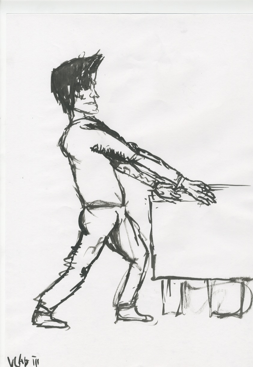
Flow, Form, and Force - Push It
Part 3 of the final Visual Language study task - Push It. With this task we are expected to immortalize a form on paper by capturing the essence of a real life figure whilst applying exaggeration to an extent to evoke a persuasive shape that signals a person pushing or pulling an object. As I've probably mentioned before, I am not good at life drawing and have rarely practiced this technique, thus, I am rusty on drawing humanoid figures that exhibit proper proportions - something I plan to fix in due time as this study task had broken the ice of life drawing. All in all, I believe that I captured the main essence of the poses, however, had not "nailed" them mainly because of leg to torso comparative proportions. For example, in the third drawing (labeled "Vlad III") the body is inconsistent with the legs as I started drawing the torso first, following with the legs, all with direct quick ink brush movements. I was not focusing on the faces of my models, thus did not spend that much time capturing the details (since the poses were timed, each 6 minutes). Overall, I dub these drawings successful (I'm mostly satisfied with "Vlad IV" since both the face and the baggy clothes resemble the style of the model, Ollie Ward), however, I will need to work on effective relative size especially when it comes to legs. I also learned that with quick and simple swipes, a persuasive essence of realism can be portrayed, whereas the after details solidify the appearance, but alas, the poses were way to quick to focus on that.
 |
| Model - Dan |
 |
| Model - Ollie |
 |
| Model - Stacy |
 |
| Model - Brenda |
Flow, Form, and Force - Like a Puppet on a String


Flow, Form, and Force - Rhythm Is A Dancer


Monday, 14 March 2016
Interior Drawing: Fenton - The Dart Room


As the final drawing, I decided to make a one point perspective drawing solely because of the darts on the wall. Along with the bar drawings, this one could finalize the jazziness and liveliness that I wished to represent in my designs, suitable as multiple interconnecting backgrounds for an animation (possible an actual one in the future). For sake of simplicity, I drew this drawing in the classic pencil-watercolor-sharpie technique which gives me an opportunity to focus on smooth movements with brush to add essence to the contour lines which are to be drawn afterwards. The perspective of the drawing allows it to be used as either a general shot that when filled with characters introduces the tone of the bar, or a focal point background where two characters in the foreground place their eyes on the darts, consequently blurring out the surroundings. The color of the drawing is mainly warm, whereas the cold contrasts are either darkened (like the green) or desaturated, making the blend more subtle whilst creating a "wooden" feel as if the bars walls simulate those of olden times (same goes for the texture). With all this taken into consideration, I believe that the background's story focuses on the darts as if they are the connecting point of the story. For example, if two characters were to approach the darts, considering whether they should play, this would be the introductory background of that action, followed by side shots while they are playing darts. Because of the absence of light, this background can be manipulated with post-production lighting effects which would place an emphasis on an object/element wherever the light is exposed.
Interior Drawing: Fenton - Two Sides of Bar
In contrast to the previous drawings, these evoke a more friendly tone, one perfectly fit for a calm background where the closest of friends sit down to make conversation and have a good ol' time. Both in a duality-driven form like the previous ones, but differentiating in styles and procedures, these drawings immortalize the vivacity of the bars in their greatness, and I believe that with the firm colors I've used they can be used as meeting points backgrounds where characters meet up to discuss, either plans or trivialities. However, I believe that they should be used sequentially in an animated series for the space to build character and possess its own intricate story (similar to The Drunken Clam from Family Guy).


In this drawing I reversed my most common procedure for the sake of experimentation where I first laid out the watercolor and followed its movements with a drawliner afterwards. Difficult for capturing accurate proportion, however wonderful for expressionism, this style allows the natural dissemination and combination of fresh watercolors to form shapes and forms, which can then be split apart with a firm line - something I was going for. The texture of the drawing adds a level of naturalness, which I believe can more effectively capture that pub zest than a digital design. Decent, for a first try, but this technique requires a lot more practice to be properly mastered, but it is a start for me. Not to house significant characters, I'd use this drawing as an establishing shot for the introduction of the bar scene, followed by the main scenario (next drawing).


As for this second drawing, I was trying to combine thick ink exposure with desaturated watercolors on top. With a two-point perspective, the whole space seems 3D instead of flat. Much more expressionistic than the previous drawing, this one is set for a developing bond between two characters (hinted by the two chairs), be they lovers or best pals, where problems and situations are generally discussed only to be solved with the ideas concocted at the bar, fueled by the drinks that warm up the entire atmosphere. In terms of lighting and shadowing, the dried up ink movements with a brush on the bottom till create a contrast with the light (hinted by the colorful exposure) coming from behind the bar where all the drinks are stored. Indirectly, by trying to create shadowing I also introduced the dominant texture of the drawing which is the smudged ink on the table and the side windows above the posters which add to the whole natural feel. As for perspective, because the characters would be visible from behind as they are sitting on the chairs, or we are able to see one fully and the other's back if they are facing each other, I felt that the perspective should be from a lower angle to insinuate the greatness and focal point of these characters as they engage in a conversation.
Sunday, 13 March 2016
Interior Drawing: Fenton - Hall and Pool Table

 In this drawing, I primarily used the pool-table's bulk to add vagueness and obscurity to the entire contextual situation that I tried to create with the background. A murder has occurred in a pub, completely devoid of detail, however, whose procedure has been captured with the blood of the victim being splattered around the space, pacing the movements of the killer and the body. For example, the blood splatter at the jukebox signifies that the main blow was executed there, whereas the markings on the floor (smudged, to insinuate movement) show the movement. However, the notion that I tried to convey was the openness to interpretation, where someone might interpret it as such: the victim had been disabled there, then carried of to another space (which is feasible given my second drawing that continues the story). What I tried to pull of was to use background/element conventions of olden horror and crime movies in one, where nowadays it is highly unlikely for a morbid murder of this magnitude to happen around a jukebox (different times, different conventions). Furthermore, the color white dominates since it is associated with something unpleasantly mechanical (such as the walls of asylums), something unnatural.
 As I said prior, this second drawing continues the story. The shadowing of the walls adds aesthetic "fulfillment" to the drawing, as I believed without it there would be an emptiness to it as the space would not feel like a space. Furthermore, with the texture of the floor (done by pencil shading over a textured wooden desk), the space comes to life as it seems more furbished. This needed not be done in the previous drawing as the thickness of the ink movements completed the composition of the drawing. The length of the hall might be perfect for a tension building scene as one walks down it slowly with ascending atmospheric horror music in the background, as the focal point is placed at the 1st third of the drawing where a unlabeled door finishes the trail of blood. To give the story a bit more vibrance, I drew hand prints on the wall, a classic trope in horror films.
Interior Drawing: Fenton

 |
| "Lock, Stock, and Two Smoking Barrels" |
Monday, 7 March 2016
Telling an Environmental Story: The Four Seasons of Death - Spring
  |
| Samurai Jack background designs |
"The Four Seasons of Death - Spring" - https://www.youtube.com/watch?v=DYKV6BdeWp8
Friday, 4 March 2016
Exterior Drawing: Central Village - Referential Photography
Although for this space I was pretty certain of which perspectives I was going to draw, I took photos just so that I have an additional reference along with my initial sketches. One thing I noticed was that neither of my drawings did not match the space layout of the photographs, although I took them from the same position and location at which I drew. I believe that if I were to capture them precisely I would have to measure the pictures and discard sketching by the eye altogether. Safe to say, all of my drawings resemble Central Village's contours, and although the color schematic and background elements are completely contrasted, several peers and friends I asked "which space in Leeds is this?" answered with Central Village. The pictures, I believe, were the most efficient references when it came to precise geometrical drawing of the skeleton, and because I was so skeptical of making a "fatal" mistake during the watercoloring, I printed them out on paper as a mean to start over. Only the first one (the frontal perspective of the main entrance) did I redo, needless to say, that it was the very first drawing I did with that technique.


Exterior Drawing: Central Village - Side Road
 The final drawing is the most 3D structured one in my opinion. With this last one I wanted to recreate a space with different visible elements of perspective, one frontal, one back, and one that lies in the midground. The sketch omits the background's original appearance hence I thought that would diminish the other paintings in a sequence (as there are no additional building structures in the background, so the same with this). Furthermore, this is the only drawing that does not piggyback on the concept of a nightmarish setting, which makes it a malleable background piece which is open to testing all sorts of animated characters' movements - pne down the stairs, one on the side of the building, one closing up to the camera with the main road, and perhaps one that goes off screen near the tree. I feel that this would be a perfect background for a Scooby-Doo style chase where the emphasis is placed on the characters' rapid movement and whimsical and chaotic interactions between characters. I believe that the spacial illusion is created with the small grass patch next to the stairs as with the repetitive black lines it appears as a slope, carrying the whole flow.

Thursday, 3 March 2016
Exterior Drawing: Central Village - Stairs and Two-Point Perspective

 Following the previous drawings, I noticed that I did not draw structures posed from a lower and a two-point perspective. Since the space is ascendingly high, based on the sketch of the very first frame that captured my eye when I got there to sketch, I drew the two main buildings that reach the skies, more or less. In the same style, I thought that this drawing would be the most bottom perspective out of them all, and the first thing I associated it with was a view which places an emphasis on the sun or something occurring in the skies. Initially, it reminded me of Insomnium's "Shadows Of The Dying Sun" cover where a black spherical star is in the center, and such an animated feat can be placed in the middle of the drawing, covering the skies in darkness (compatible with my previous nightmarish backgrounds of the same space). Furthermore, the shading on the windows (done with ink + color on a brush) as well as the vertical cracks on the buildings would increase as the sun would darken more and more, covering the skies. As for the furthest background, I wanted the texture of the sky to mimic Leeds' on a gloomy day, which proned me to use such devoid colors.

My second drawing was from a lower perspective, but one that a small creature would have from encountering a small set of stairs. The 3D illusion is pulled off in this one by the two-point perspective building behind that I've done quite geometrically, despite the thick lines. The windows and small inner details are done with rampant strokes of 0.5 and 0.7 fineliners, whereas all the thicker lines are with a metal wire and small brush covered in ink (same done with the previous one). The depth would be put into an animation the moment a character interacts with the space, where his/her body would be covered by the stairs as he/she moves forward and follows the road after the stairs.

 |
| Initial sketches |
Subscribe to:
Comments (Atom)